CSS Coding Course
CSS 101
Part 8a. Text & Fonts
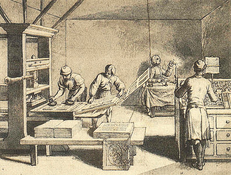
The Information Revolution & The Digital Age
If a picture is worth 1000 words, then the importance of words is not completely eliminated by the use of pictures. Since the invention of spoken languages and the written word, perhaps one of the greatest advances in human technology was the invention of the movable-type printing press by Johannes Gutenberg at around 1450 CE. This invention made printed material like books much easier to produce in large quantities, and that made the written word more available to the common people. That event alone spurred an information revolution that allowed more people to learn how to read, and become better informed and educated. But that was only the beginning, as there would be many more technological advances to come in the future.
Certainly, the inventions of radio and television, and the various forms of recorded audio and video media, produced more gargantuan steps forward into the Information Age. A few short-sighted cynics even announced the end of our educational institutions, claiming that the general public would then be able to learn any and every college subject over the airwaves. Obviously, that never happened either. And if you look at the quality of radio and television programming these days, you will see how ludicrous those predictions were at the time.
With the arrival of the Internet and reasonably-priced personal computers, the red flag was raised once again. Certainly now we could hear the death knell for colleges and universities, as virtually any person could now learn any subject they desired to learn from the comfort of their own home, by browsing websites and watching online videos. But as we all know, that certainly is not the case either, as our children struggle with rudimentary reading skills, even though they have high technology at their fingertips through every waking hour of their daily lives. In fact, all schools, colleges, and universities rely on these technological tools as well. Education through high technology is definitely here to stay.
The bottom line here is that the written word is not going away anytime soon. If you think you can learn everything you need to know from watching TikTok and YouTube videos, then please feel free to try. But in reality, book sales are up and continuing to rise, even with the immense amount of online content available on the World Wide Web. Everyone it seems now has a website, several email addresses, and accounts on many different social media platforms. The ability to read and write has never been greater. And the demand for more people to provide and publish more online content is growing exponentially. As a society, we have progressed from books to magazines to newspapers to all of the above now available online.
Books published on the subjects of our rapidly changing technologies are obsolete before they are even published and arrive in print. However, websites can be updated immediately, as soon as the tiniest change occurs in our modern technologies. Welcome to the Digital Age! Your future is very bright. Please wear sunglasses.
Quick Review
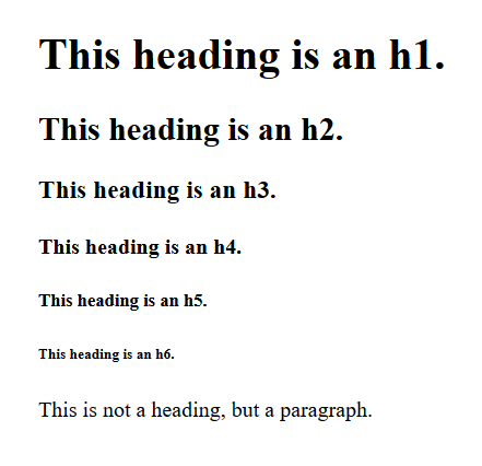
Before we dive in, let's quickly review what we already know about Default CSS, and the elements of headings and paragraphs. As you may recall, all headings from h1 to h6 have a default font-weight of bold, while a paragraph has a default font-weight of normal. That said, we also need to know that all headings and paragraphs have a default font-family of serif. And we need to remember that both the h4 and the paragraph have a default font-size of 16px, even though they have different font-weights. And lastly, an h1 has a default font-size of 32px, and all of the other headings have font-sizes worthy of their tag names. We suppose it's also appropriate to mention that the default text color for all of the above is indeed black.
But remember that the beauty of CSS is that we can change the defaults for any of these text elements by changing the values of their properties to anything we like better. And we can change it for every single element with that tag name, or we can change some of them by using a class name, or we can change just one of them by using an id name. But you already know that so let's move on.
Default & Fallback CSS Font Families
As we already established, the default font-family in CSS is serif. If you do not specify a font-family, then Default CSS will choose serif
every single time. Also, if CSS cannot identify the font-family you specified, then Default CSS will
choose serif to display whatever text you asked it to display. Think of that as something like that little green
square  you get when HTML cannot identify the image file you specified. Rather than
displaying no text at all, it simply falls back (remember that term) to serif.
you get when HTML cannot identify the image file you specified. Rather than
displaying no text at all, it simply falls back (remember that term) to serif.
"So... what is a fallback font?" you ask. A fallback font is the last font listed in a list of possible fonts, and its job is to provide a suitable default font in the event that none of the other fonts listed are available, supported, or found. For instance, you might see a CSS rule that looks like this: font-family: Arial, Helvetica, sans-serif; and this is not unusual for well-written CSS. What this CSS rule is telling the web browser and operating system is to try to use Arial font first, which is a TrueType font that is used extensively by Windows. However, if for any reason that font is not available, then try to use Helvetica font, which is traditionally a TrueType font that is used by Mac OS, especially older versions of it. And if that font selection fails as well, then use whatever your system uses as a fallback font for sans-serif. By using these three font choices in this order, there is a really good chance that your web page will look good on almost every computer that visits your web page.
Most web browsers on most operating systems have five fallback font-families:
- serif
- sans-serif
- monospace
- cursive
- fantasy
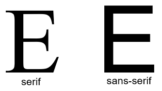
And before we get too much deeper in the water, we need to know what a serif is, and maybe even what sans-serif is as well. Notice that the default font-family we call serif has those little curlicues on each of the letters, numbers, and other characters. Those little curlicues themselves are known as "serifs" in the world of fonts and calligraphy. But you probably noticed that the font-family we call sans-serif is devoid of those curlicues. That is because sans is a French preposition that means without. So sans-serif means "without serifs", or without those funny little curlicues.
We generally tend to use fonts that are more sans-serif in nature rather than serif fonts. But it often depends on the style of the website. If the website is a blog or a news story, then a serif font allows the web page to look more like the news in a printed newspaper.
Of course in a monospace font, all of the characters are the same width, regardless of whether they are traditionally wide letters, like the m or w, or skinny characters, like a . period. Monospace fonts are used to display plain text. Just look at the width of these letters: abcdefghijklm nopqrstuvwxyz.
And it might go without saying that a cursive font is one that is supposed to resemble script or handwriting. And similarly, a fantasy font is one that is very ornate or decorative in nature.
But the most important thing you need to know about these fallback fonts in Default CSS is that they are often different for each web browser on each operating system. And it appears that the operating system has some control over the web browser in deciding which fallback fonts to use in Default CSS. After all, the operating system doesn't want the web browser to select the name of some font that is not stored locally as a system font. But it also appears that the web browser has the prerogative to select a different font that is different than the font that the operating system would prefer, as long as that font exists as a system font. And we will soon see that more clearly in the examples we will show you now.
Of course, the manufacturers of operating systems would prefer that you use their web browser to any other browser that is available to you. And that becomes annoyingly evident as a newly-installed browser asks if you would like to make it your default browser. Microsoft would prefer than you use Edge as your default web browser. And Apple would prefer than you use Safari as your default web browser. And while Microsoft does offer a Mac version of Edge that Mac users can install, why would any self-respecting Mac user want to do that? Similarly, users of Windows can install an older, unsupported version of Safari on Windows, but that seems rather silly as well, unless you want a cheap way to ensure that your code is compatible with older Mac computers. And, as if the Battle for Dominance in the Browser War wasn't bloody enough, Google is doing everything possible to win the war by constantly asking users if they would like to switch to Chrome, every single time they use the Google Search Engine on a browser that is not Chrome. But if you are really interested in who is winning the Browser War, look no further than StatCounter GlobalStats. That alone will explain why we are adamant about testing your web code on Chrome. But enough of this! Let's get back to the discussion of fallback fonts and Default CSS.
We tested five different browsers on three different operating systems in an attempt to determine what the fallback fonts were in Default CSS for each one. As of this writing, these are the results of our tests.
On Microsoft Windows, we tested Chrome, Edge, Firefox, Opera, and Brave. And we got the following results on all five browsers , with only one notable exception: on Firefox, fantasy falls back to Arial. Otherwise, you can see the results below. Granted, we don't consider Comic Sans MS to be a very cursive font, nor do we find Impact Regular font to be inspiring very much fantasy. But these are the fallback fonts for these five browsers on Microsoft Windows.
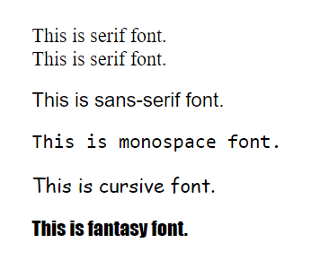
- serif falls back to Times New Roman system font
- sans-serif falls back to Arial system font
- monospace falls back to Consolas system font
- cursive falls back to Comic Sans MS system font
- fantasy falls back to Impact Regular system font
On the Apple Mac, we tested Chrome, Safari, Firefox, Opera, and Brave. And we got the following results on Chrome, Opera, and Brave.
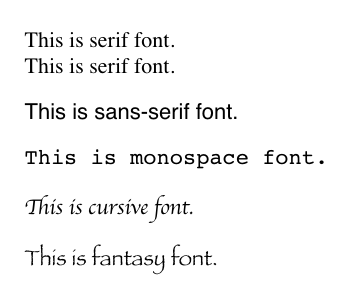
- serif falls back to Times system font
- sans-serif falls back to Helvetica system font
- monospace falls back to Courier system font
- cursive falls back to Apple Chancery system font
- fantasy falls back to Papyrus system font
However, Firefox substituted Menlo system font as the fallback font for monospace. And Safari also substituted Menlo system font as the fallback font for monospace. But Safari also substituted Zapfino system font as the fallback font for fantasy as well, and Safari was the only browser that did this. Apple has historically always taken great pride in their selection of fonts, and it certainly shows here. Apple Chancery is truly a beautiful cursive font that makes Comic Sans MS font look... well... rather comical. And certainly Papyrus and Zapfino fonts are absolutely "fantastic" to look at, and worthy of being called fantasy fonts. Below are how these fallback fonts look on Safari.
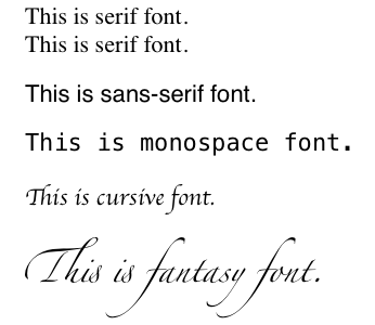
The only drawbacks to using any of these cursive or fantasy font typefaces is that they will default to different fallback fonts on Windows and Linux web browsers, and for that reason alone, we recommend that you avoid using them at all.
And that brings us to Linux. We tested Chrome, Chromium, Firefox, Opera, and Brave on Linux Mint and found the following results on all four browsers except Firefox.
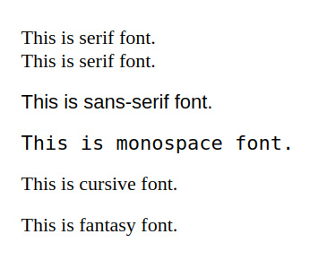
So... what's wrong with this picture? For one thing, cursive or fantasy fonts appear to fall back to the default serif font! And if we've learned anything here during this lesson, it is that CSS defaults to serif whenever you do not specify a font-family, or when it cannot identify or find the font-family you specified. And it was difficult to determine which system fonts Linux Mint falls back to for generic serif, sans-serif, and monospace fonts. So apparently Linux takes care of that so that you don't really need to know what system fonts they are using.
And we wish we could end the discussion here, but Firefox has defined fallback fonts for all of the above on Linux Mint, as displayed below.
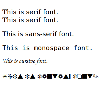
For Firefox on Linux Mint only...
- serif falls back to DejaVu Serif system font
- sans-serif falls back to DejaVu Sans system font
- monospace falls back to DejaVu Sans Mono system font
- cursive falls back to this system font that we could not identify
- fantasy falls back to this system font that we could not identify
Now before we move on, here is the Fallback Font Test Project we used to do these tests. Please download it, extract it, and then test your own web browser(s) to see what the default system fonts are that CSS uses as fallback fonts by default.
Selecting Font Families
That was a very long but necessary section because you really need to know why we specify more than one font-family in CSS. In fact, you will often see sans-serif font selections as font-family: Arial, Helvetica, sans-serif;. Or, you will see serif font selections as font-family:'Times New Roman', Times, serif;. And for monospace font selections, you are likely to see font-family:'Courier New', Courier, monospace;. Notice that font-families that have more than one word in their names and are separated by spaces need to be enclosed in quotes or double-quotes.
This might sound repetitious, but it is important to recognize that the first font-family listed, in all three cases above, is the default fallback font for Windows, Mac OS. and Linux, in that order. One of the newest methods for specifying system fonts is by using font-family: system-ui;. This method is now supported by over 95% of all web browsers, so you might want to give it a try in one of your newest web projects. However, attempting to type that in VS Code will produce this intellisense suggestion: font-family: system-ui, -apple-system, BlinkMacSystemFont, 'Segoe UI', Roboto, Oxygen, Ubuntu, Cantarell, 'Open Sans', 'Helvetica Neue', sans-serif;. Apparently, one of these font-families will be found on almost any computer, and this CSS rule might take up a lot of space on your stylesheet, but it should produce great sans-serif font results.
Fonts and Typeface Designs
Even the word type in English is an overloaded word. That word can be a noun, or it can be a verb. It can mean the act of producing text, or it can refer to the text itself. It can also signify various kinds of similar things. One could even facetiously state that there are several different types of type. So what can we do to add some clarity to this murky subject? One way is to avoid using the word type when we should be referring to text. Text is the written or printed word, regardless of the style or method used to write or print it.
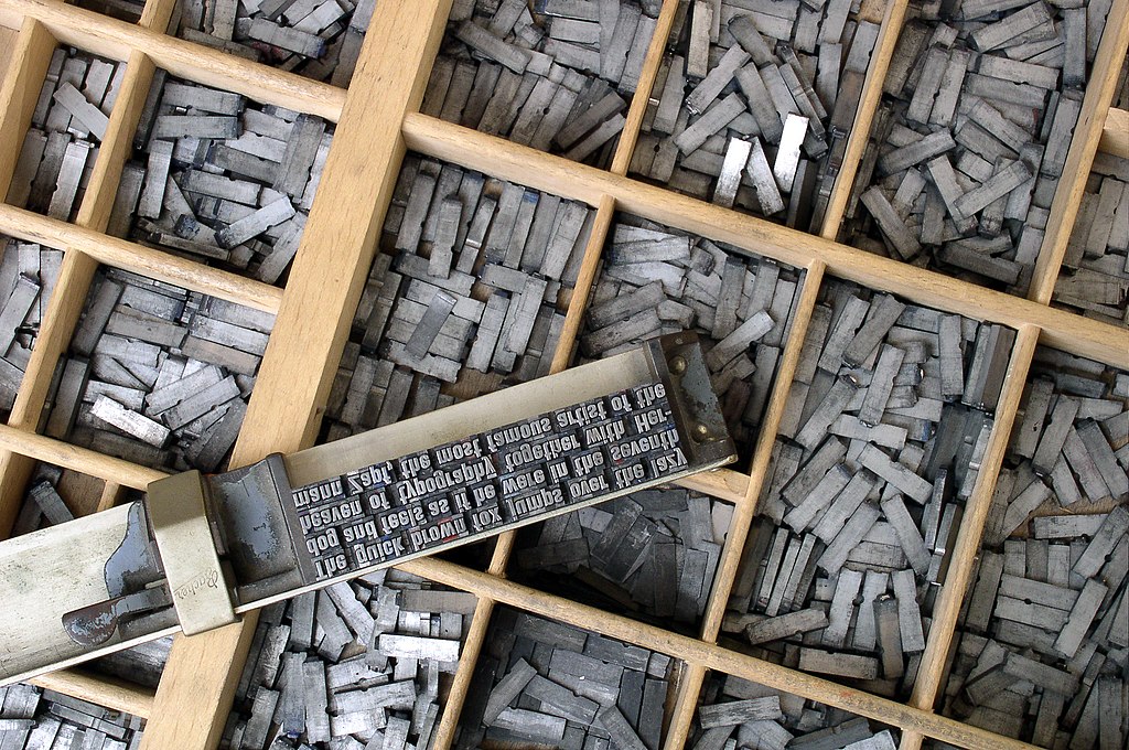
When we started this discussion, we began by talking about Gutenberg and his history-changing invention of the movable-type printing press. What made that invention so innovative was that moveable type... (there's that unavoidable word again) is made up of collections of individual letters, numbers, and other characters that can be arranged together in some order to produce text that can be printed on paper. Originally, the job of arranging those letters went to a person called the typesetter, and the job they did was called typesetting. Talk about a job that required special skills, once upon a the time, this was it! First of all, the typesetter had to know the language just as well as the author of the book, or the journalist writing the newspaper article. And then, the typesetter had to find all of the letters and characters required to create the text. Those characters also needed to be the same size and in the same typeface as all of the other characters in the same lines of text. And then, those characters needed to be arranged in order, only upside down and backwards. Once the book was printed, of course all of the accolades went to the author of the book (Darwin, Freud, Tolstoy, etc.) with zero recognition for the typesetters who worked so hard to transform these writings into the printed word.
Look at the small block of text that was just typeset in the picture above. It is hard to read because it is upside down and backwards, but what it actually says when printed on paper is:
The quick brown fox jumps over the lazy
dog and feels as if he were in the seventh
heaven of typography together with Her-
mann Zapf, the most famous artist of the
And it may interest you to know that the reason why these words are sometimes chosen — the quick brown fox jumps over the lazy dog or THE QUICK BROWN FOX JUMPS OVER THE LAZY DOG — is because these words use every letter in the English alphabet. Another thing you might find interesting is this mention of Hermann Zapf. Click on the link to read about him. People who design typefaces are called typographers. These people spend their days designing typefaces using Adobe Illustrator, or some other vector graphics design tool. It's a skilled profession just like web development. Being a graphic artist requires specialized skills just like any other profession. As web developers, we rely on professional graphic artists who produce images with Adobe Photoshop, and photographers and videographers who also have specialized skills and software tools they use with each of these mediums. It is becoming harder and harder to become a "one-man band".
"Gee, thanks for the long explanation, but what is the different between a font and a typeface anyway?" Actually, web developers seem to use the two terms interchangeably, but a publisher would certainly know the difference. A typeface is the style of the text being printed. Helvetica is actually the name of a typeface that was around long before the World Wide Web was invented. And that typeface comes in various sizes which they call fonts, sometimes measured in points in publishing and word processing, but more commonly measured in pixels in web development. Since these are very different mediums, it is difficult to compare points to pixels, but a 72-point font is about an inch high, and a 36-point font is about a half-inch high. Just as we couldn't really compare the primary pigments to the primary colors, we similarly cannot compare printing on paper to displaying text on monitor screens.
However, computers use pixels, and pixels cannot be easily measured by their physical sizes. Due to all the various differences in screen sizes, resolutions, aspect ratios, and the density of pixels on each (measured in DPI, or dots-per-inch), computer fonts are generally measured in pixels. And that is because a 10-pixel font might look tiny and unreadable on a huge 4K monitor, but it might be completely readable on the screen of your smartphone. To make sure text is readable on all devices, we must make sure that our text is mobile-responsive and that might require changing font-sizes through media queries, but that is an advanced subject for another time.
And as cringeworthy as this discussion may seem to you at this point, the bottom line is that typeface can refer to the style of the font we use, regardless of the font-size we select for its display. What the publishers and typographers call a typeface, we find that web developers call the same thing a font-family. And what publishers and typographers call a font, web developers would call that a font-size. We hope that explanation adds some clarity. As a web developer, you will define text by its font-family, and by its font-size, and by its font-weight, and by its font-style. There are many other attributes and values to explore as well, like color, font-stretch, text-shadow, letter-spacing, and line-height, to name a few. We will dive into those CSS style rules later.
Font Formats & Web Fonts
As you might already know, there are actually thousands of different font-families to choose from. But more importantly, there are several different types of web fonts as well. In order to move beyond the limited number of system fonts that are available (and yet are often in conflict from system-to-system and browser-to-browser), we need to explore the world of web fonts next. This W3Schools Web Fonts Reference is very helpful in sorting all of this out. In short, there are several font formats to choose from:
- SVG
- TrueType (TTF)
- OpenType (OTF)
- Embedded OpenType (EOT)
- Web Open Font Format (WOFF)
- Web Open Font Format 2 (WOFF2)
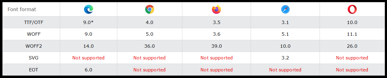
Since Google no longer supports the SVG font format, we mention it here only to complete the list. In fact, it appears that Safari is the only browser that offers full support these days. If over 65% of the world uses Chrome (or Chromium-based) web browsers, then you should avoid using SVG fonts completely, regardless of how beautiful you think they look.
The system fonts we have so far been using are considered to be TrueType Fonts (TTF). And they are part of your computer's operating system. However, you can download and use other TrueType fonts that are not system fonts, but you will need to include those fonts as files with your web site or provide links to those files so that they can be automatically downloaded and used by your web pages. We will include more information about this process soon.
OpenType Fonts (OTF) are similar to TrueType Fonts (TTF), but remember what we learned about vector graphics when we discussed images? Fonts are actually collections of vector images, and that is why they have such amazing scalability. Anyway, the big difference between the OpenType and TrueType fonts are that they use different outline formats. The character outlines in OpenType fonts are made of cubic Bézier paths, and the character outlines in TrueType fonts are made of quadratic Bézier paths. And we are sure that is already TMI (too much information). But if you are still curious about Bézier Curves, please feel free to follow this link.
Microsoft's Internet Explorer is now an obsolete relic of the past. For that reason alone, using files of the Embedded OpenType format should be avoided as well. Once again, we mention this format so that you know it exists, but hopefully you will never need to work with it. Although we should mention that OpenType fonts, like TrueType fonts, are not really going away anytime soon. But as for the EOT file format, it is going away, and that can't happen soon enough.
Web Open Font Format files, WOFF and especially WOFF2, are another story. WOFF and WOFF2 is the modern way to use both legacy OpenType and TrueType font formats. These font formats use compression, and that greatly increases font-loading and font-rendering speed, and that helps overall performance. Ideally, the use of web fonts should be seamless. Visitors to your web pages should never be able to detect that you are using special web fonts beyond their own computer's system fonts.
In our future projects, we will be using WOFF/WOFF2 formats through Google Fonts, and we will also be using Font Awesome for icons. There are two ways to create links to these online resources. And you will find that this is the quick and easy way to find and use suitable fonts in almost any style in the modern age of web development.