CSS Coding Course
CSS 101
Part 5. The Good Stuff
Plane Geometry
Since we now know about the div and class and id attributes, let's learn how to create some basic two-dimensional shapes using them, and also about the methods we would use to style them. For this project, we will create squares, rectangles, circles, ellipses, and triangles. This is going to be fun, so let's dive right in!
Start by downloading this ZIP file, and then you can extract all of its files into a folder called plane-geometry, which you will then copy into the same old CSS Coding Course folder, just like we've done several times before. Once the folder is there, you can open the project folder with VS Code so we can begin. And when you click on Go Live, it will look like this (click here). That looks terrible, right? But we will learn how to fix it so that it will look like the picture below.
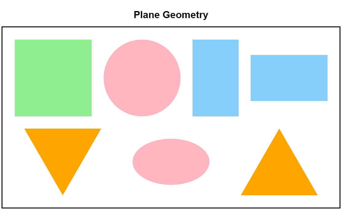
NOTE: If your screen resolution is not 1920 x 1080, then your Go Live and preview screens may look a little different. It is quite possible that your geometric shapes are on more than just one line. And if that is so, then please just continue on. The lessons you will learn here will be the same, even if the screenshots don't match perfectly.
The code in our index.html file is actually very simple. We have an h1 heading at the top of our document body, followed by a container div, and we chose to give that div a class name of shapes. Nested inside the shapes div are seven other divs that we gave class names related to various geometrical shapes. That's pretty simple, right?
But we should first of all try to understand why there is all of this awful red color in the background, and how we can fix it. Actually, that red background is there for a purpose. That's an old trick we can often use to try to figure out where the HTML document begins and ends in proximity to our document body.
Let's look at the code in our style.css file. Ah! There's the culprit! There is only one CSS rule for html { } and it is background-color: red;. Every pixel of red on our web page is being caused by this one CSS rule! And we could easily fix this by changing that one CSS rule to background-color: white;, but let's not do that. The point of this old trick is to teach you how to distinguish the boundaries of the html document from the boundaries of the document body. Remember that everything between the opening and closing html tags is considered to be the html document. Therefore, it stands to reason that everything between the opening and closing body tags is considered to be the document body. And you will notice that there is a lot of CSS code here that is commented out (on purpose).
Thanks to Emmet, there is an easy way to comment out our code, and to uncomment it as well. Simply highlight the line or lines of code you want to comment out or uncomment, and then type Control + / on Windows, or Command + / on a Mac. When you do this the /* and the */ will either appear or disappear, and the color of that line of code will change to or from the color green.
If you are having trouble with this, remember that the Control key (or the Command key on a Mac) works just like the Shift key, meaning that you can hold that key down for as long as you want and nothing happens until you press another key while that key is depressed. And in our case, holding down Control (or Command) and then pressing the forward-slash / key repeatedly acts as a toggle that turns the comment/uncomment feature on and off.
If we comment out line 11 of the document body { } rules, then only part of the white background goes away. In fact, only the h1 is surrounded by red. That is because the h1 is part of the body, and because we also have white background rules for the shapes div on line 27 as well. So now, let's comment out line 27 as well. Now everything on the page has a red background. So what did we just learn? We learned that everything in the html document will inherit the CSS rules of the html document unless we change those rules to something else.
Inheritance is a wonderful thing! When a parent leaves this world, a child of that parent will inherit money and material things from that parent. But if the parent has nothing, then the child will inherit nothing from the parent by default. This is also true of Default CSS rules in that, if the parent has nothing in the way of CSS rules, then the child will not inherit any CSS rules from the parent. That's just the way it goes sometimes.
And inheritance in HTML and CSS is similar. The html document is the grandparent of this entire "family". However, the document body is the direct child of the html document, because the html document is its parent. And in our code, the shapes div is the direct child of the document body, because the document body is its parent. And the shapes div has a huge immediate family with seven children, and they are all children of the "shapes family" because the shapes div is their parent. But each of these item divs do not change color because they have CSS rules that override the rules they would normally inherit from the html document, the document body, and even the shapes div. If you look down the CSS stylesheet, you will see CSS background color rules for each of the geometric shapes: the square, the circle, the ellipse, rectangle1, rectangle2, triangle1, and triangle2. It is very important to understand how inheritance works, so if you still don't fully understand, then please read these last two paragraphs again.
And yet, as fascinating as all of this is, the background of our entire html document is still very red. So, let's fix this now. We can do this by simply uncommenting line 11. When we do this, we see that the entire document body now has a background color of white. This also means that line 27 was redundant code. Whether we comment out or uncomment that code, the background color of the shapes div remains white because it inherits that background color from the document body.
But as the old adage goes, "It's hard to remember that your job was to drain the swamp, when you are up to your neck in alligators." So, let's continue on our quest to eliminate the red menace. Now let's uncomment line 13 to see what that does for us. That did something alright: it moved the h1 to the center of the web page. Now let's uncomment line 14. OK, that did something major. It changed the minimum height of the document body to 100% of the viewport height! That's the English translation of min-height: 100vh;. But now there is a scroll bar on the right side of the web page, and if you scroll up and down, you find that there is still a red border around the document body on the left-side, right-side, top, and bottom. How awful is that?
What do we know about the rules of Default CSS that might be causing such a thing? Well, we know that all elements (except the html document) might have a little bit of margin and/or padding built into them by default. And the document body is no exception. Plus, it's easy to get confused by margin and padding. We need to know that margin is along the outside edges of an element, and that padding is along the inside edges of an element. That's a rather simplified explanation, but for now, it will have to do.
So next, let's uncomment line 16. That will set the margin on all four sides of the body to 0. Amazing! That removed the red border on the left-side, right-side, and bottom. But we still have a red border on the top, and an unnecessary scroll bar!
Now let's analyze what is happening on line 15. This rule padding: 10px 0; puts 10 pixels of padding on the top and on the bottom, but it also puts 0 pixels of padding on the left-side and on the right-side of the document body. Maybe there is more padding on the top and bottom than 10 pixels by default! Maybe that's what is causing these last two problems. And by uncommenting line 15, the scroll bar goes away, and the red border at the top goes away as well. And even though the entire html document still has CSS rules for a red background, we managed to cover all of that up with our document body rules. And in effect, we made our document body the same size as our html document. We did it!
But there are still many more rules in this stylesheet that are commented out. And our web page does not look like the picture above. So, let's fix that next.
In the CSS rules for our shapes div, the only rules that are not commented out are creating what is commonly called a flexbox. We have not formally introduced you to flexbox, because we have not actually introduced you to the display descriptor either. All of that will be discussed very soon. But for now, let's just briefly talk about these four lines of code from line 23 through line 26. Of course, there can be no flexbox without line 23. Line 23 tells HTML that we will be using flexbox by stating display: flex;. On line 24, we tell HTML to wrap the contents in the flexbox to the next line if it exceeds the width of the flexbox. We do that by saying flex-wrap: wrap;. And on line 25, we are telling HTML to align all items in the flexbox in the center vertically. That's what align-items: center; is telling HTML to do. And on line 26, we are telling HTML to space all the items in the flexbox evenly and horizontally. We do that with justify-content: space-evenly.
But the items in our flexbox may not currently exceed the width of the flexbox. And if so, they may not wrap to the next line. Now let's uncomment line 20 which changes the width of the flexbox to 55% of the document body width. OK, that worked! The width of the flexbox is now 55% of the body width, and the items inside the flexbox did indeed wrap to the next line, and maybe more. But the flexbox moved to the left side of the body, so the flexbox itself is no longer centered horizontally, even though the items inside the flexbox are. That seems odd, right? After all, on line 13 of our body rules, we told HTML to text-align: center; and in HTML, that means to center everything, not just text! So, what is wrong here? The problem lies with line 16 of the body rules. We told HTML to give everything inside the body 0 pixels of margin on all four sides: top, right-side, bottom, and left-side. And therein lies the problem, because the left-side and the right-side have 0 pixels of margin, so it is doing exactly what we told it to do. Amazingly enough, uncommenting line 21 will fix this. The CSS rule margin: auto; take all of the horizontal space available and splits it evenly between the left-side of the flexbox and the right-side of the flexbox. Thus, if you do this, it splits the marginal space available automatically. OK, now it is starting to look more like what we wanted.
That leaves three other lines in the shapes div commented out. Now remember that line 27 is redundant. The background-color of the shapes div will inherit the background-color of the body, so in this case, it does not matter whether you uncomment it or not. So, let's be brave, and uncomment line 28. Line 28 says, outline: solid 3px black; and we could have just as easily said, border: solid 3px black; but we wanted you to learn that outline and border are very similar, but not the same thing in HTML. The main difference is that border is part of the element it is assigned to, whereas outline is just outside of the element it is assigned to. Remember how padding is on the inside, while margin is on the outside? Bingo! Likewise, border is on the inside, while outline is on the outside. Right now, that doesn't matter much to us, because we have lots of extra space to work with, so 3-6 pixels in any direction isn't going to make much difference, right?
But now there is another problem in that, some of the geometrical shapes are touching the outline, and some are not. And some of the shapes may be touching each other! And whether we use a border or an outline, this problem will not go away... until we uncomment line 22. And line 22 states, padding: 20px;. That CSS rule puts 20 pixels of padding on the inside of the flexbox on all fours sides, all the way around. Nice! That certainly pushes the items in the flexbox away from the outline, but the spacing between the items still looks imperfect. There must be a way to fix that as well.
And there is! Here is another old trick we like to use that works well, even if you are a beginner. When you are trying to figure out spacing issues and how to fix them, it can be difficult when the items we are trying to align are all different shapes and sizes. So, we can create temporary borders (or outlines) to see exactly where everything is in relation to all of the other elements. And there is a red outline rule as the last line for every shape inside the shapes div. So, let's uncomment all of them. They are on lines 36, 45, 54, 62, 70, 80, and 90. And after we uncomment them, we still see the uneven spacing, but it might not seem too awful until we reduce the width of our web browser to a smaller width, or possibly its minimum width.
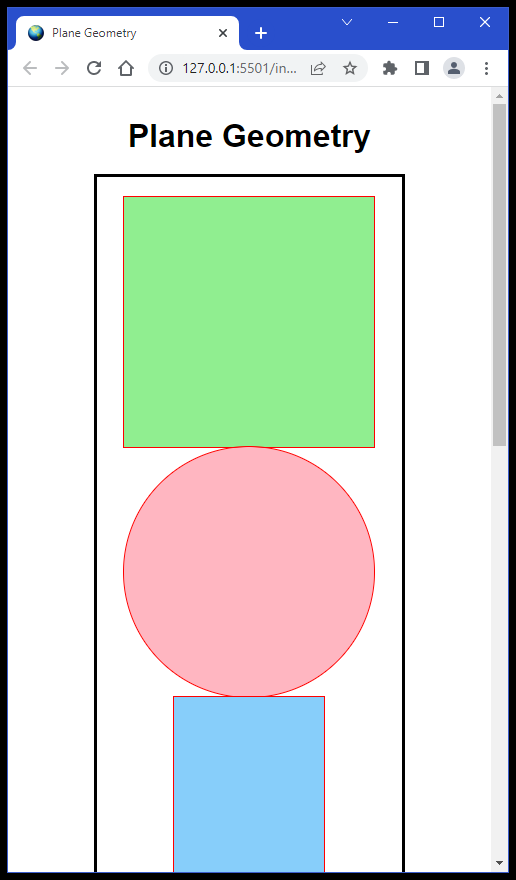
Now the problem becomes visually apparent! These items are actually touching each other when we flex-wrap them. When we flex-wrap them to one item per row, it becomes painfully apparent. But even other screen widths will uncover this problem as... sometimes the shapes touch each other, and sometimes they don't. Regardless, it is still an issue that needs fixing.
One other issue also become apparent. We chose to use outline instead of border for these temporary borders/outlines. But if you look closely, you will see that the outlined shapes actually overlap a little bit. This would not have happened if we had used borders, because borders are on the inside of the shape elements, while outlines are on the outside, and that makes them overlap. With borders, the shapes would have still touched each other, but they would not have overlapped. Since these are only temporary visual aids for us as coders, it really doesn't matter. But please make a mental note about this for future reference.
So now, let's uncomment the other lines that add margin to each shape. You might ask, "Why margin, and not padding? And of course, the answer is because we want space on the outside of each shape, not on the inside of each shape. So let's uncomment lines 34, 42, 51, 60, 68, 76, and 86.
Now let's take a look at it in all possible screen widths. Wow! That really seemed to do the trick. The spacing is much better. The shapes no longer touch each other, regardless of the screen width. So now we can comment out those red outlines on lines 36, 45, 54, 62, 70, 80, and 90.
And whether you realize or not, you just created your very first mobile-responsive website! What that means is that this web page should look just fine on any device whether it is a desktop computer, a laptop computer, a tablet computer, or a mobile phone. Yes, the arrangement of the geometric shapes will look different in terms of the number of objects per row. But thanks to flexbox and flex wrap, all of the geometric shapes will be there and they will be arranged neatly.
So now it should like the picture we showed you in the beginning... but wait! There are two pink circles, but the second one is supposed to be an ellipse! It's not a problem with our CSS! We have CSS rules for .circle { } and we have CSS rules for .ellipse { }. Ah! we see it! On line 24 of our index.html file, we are using a div with a class of circle instead of a class of ellipse. Change that class name and we should be good to go.
One last thing to mention before we leave this project completely is that triangles can be difficult to create with CSS. If we look at the CSS for all the other shapes, we will see how relatively easy they were to make. But the triangle is basically a shape that has 0 width and 0 height, and we do a trick with wide borders and even transparent borders to create the triangle itself. But you will learn how to do this when we do the picture-frames project, as part of the five-border-projects, when we learn about Colors in the next section.
More HTML Tags
Wait! What? Didn't we already graduate from HTML school? Yes, we did. But the very nature of web development is based on three different (but intertwined) coding languages. Hence, it is very difficult to discuss some of the HTML elements and tags without explaining how to style them with CSS at the same time. And that is why we are here. We are calling this section The Good Stuff because we will gain an enormous amount of knowledge and insight by reading this text, and completing the lessons in this section.
Now that we have a solid foundation, we can start building on what we already know. In this section, we will do a series of short projects that will introduce us to some new HTML tags and some new CSS styling techniques. And this time, we will explain what each one is doing for us.
Let's quickly review what we already know about putting text on the screen, shall we? From the six-heading-sizes project we did earlier, we know that there are six different heading tags, and each one has a default font-size, with h1 being the largest, and h6 being the smallest. We also know that all six headings have a default font-weight of bold, and a default color of black. And we know that a paragraph tag has the same font-size as an h4 heading by default, but it also has a default font-weight of normal, and a default color of black. There is more to know about each of these, but we will dive into each one of these much deeper when we get into Text and Fonts in a future lesson. However, if you can recall all of what was just discussed in this quick review, then you are doing well.
The Display Property
But before we dive in too deep, let's learn about the display property. Every element in HTML has a default display property, and most likely it has one of these three values: inline, block, and inline-block, which is a hybrid of the first two. The display property can have other values beyond these three, but they will be assigned by CSS rules that are not the default CSS rules. For instance, we used display: flex; in the plane-geometry project we just finished. And there is also display: grid; and display: none; which you will eventually see as well. These are the most commonly used values for the display property, but there are many more less commonly-used ones as well.
The reason why this is important to know at this point is because we are going to learn a lot of new tags that are all inline elements by default. But before we do, it is also important to know that the six headings and the paragraph elements are all block elements by default as well.
Block Elements
A block element is an element that has the unwritten CSS default rule of display: block; and that means that: 1) you can change the width and height of that element; and 2) it will always be placed on a line by itself. For instance, you simply cannot place two h1 elements side-by-side on the same line without first assigning each one a different value for its display property. And why would you want to? (Don't think about this too hard. It was meant to be a rhetorical question only.)
Inline Elements
Now let's talk about inline elements. An inline element is an element that has the unwritten CSS default rule of display: inline; and that means that: 1) you cannot change the width and height of that element; and 2) it will always be placed on the same line as the other elements that surround it. So now, let's see a few examples of inline elements, so that we know what in the HTML we are talking about here!
Three new inline tags we need to learn now are the <i></i> tags, the <b></b> tags, and the <u></u> tags. Of course, all inline elements need to have opening and closing tags because the text that is placed between the opening and closing tag will be changed in some way. In the case of the i inline element, the text between the opening and closing tags will be displayed in italic text. But in the case of the b inline element, the text between the opening and closing tags will be displayed in bold text. And in the case of the u inline element, the text between the opening and closing tags will be displayed as underlined text. It is also important to know that inline elements can be nested inside of other inline elements. For instance, you could combine all three of the tags we mentioned above as <i><b><u> </u></b></i> and that would let you produce text that is italic, bold and underlined. That seemed pretty simple, right? OK, let's learn about a few more inline elements.
Oddly enough, using the i, b, and u tags is considered by some to be the old-fashioned way of doing things. Using those three tags is so HTML4! And even though they were never deprecated, meaning that they were never rendered completely obsolete, HTML5 has some new tags to learn that are considered to be much better. So, let's take a look at them right now.
Five more new inline tags that we need to learn are the <em></em> tags, the <strong></strong> tags, the <mark></mark> tags, the <cite></cite> tags, and the <dfn></dfn> tags. In the case of the em inline element, the text between the opening and closing tags will be displayed as emphasized text. In the case of the strong inline element, the text between the opening and closing tags will be displayed as text with strong importance. In the case of the mark inline element, the text between the opening and closing tags will be displayed as marked or highlighted text. In the case of the cite inline element, the text between the opening and closing tags will be displayed to cite your reference source. And lastly, in the case of the dfn inline element, the text between the opening and closing tags will be displayed as a term definition or explanation.
So, what do you think? Do you see any similarities? Do you see many differences? Yes, you are correct. Except for the strong tags and the mark tags, all of the others default to italic text, and how useful is that? The answer is that it is only useful if you use your own CSS rules to change the behavior of these inline elements. We would generally never change the i, b, u, and mark default CSS rules, but maybe we would like our emphasized text to be displayed in a bold font-weight and deeppink color. So if that was our desire, we could write CSS that says, em { color: deeppink; font-weight: bold; } and that would give us this sort of emphasized text whenever we enclosed text with our opening and closing em tags. And we hope that makes perfect sense to you.
Two more inline tags that can be quite useful are the <sub></sub> and <sup></sup> tags. The sub inline element lets you display subscript, which is very useful when you need to display the name of a chemical compound such as H2O, which you might recognize as the chemical formula for water, or H2SO4, which is the chemical formula for sulfuric acid. And the sup inline element lets you display superscript, which is very useful when you need to display mathematical exponents like E=mc2, which you might recognize as Einstein's formula for the Theory of Relativity, or A=πr2, which is the formula we use to calculate the area of a circle.
Now we need to talk about the extremely useful <span></span> tags. What makes span inline elements so powerful is that we typically assign class attributes to them. So, if those other inline elements we just talked about don't do exactly what you want them to do, then feel free to design a span class so that you can use that inline style repeatedly. In fact, a set of opening and closing span tags with text in-between them by default does nothing to change the text between the two span tags until you add some CSS rules to your CSS stylesheet specifically designed to change span elements, like we did in the paragraph above with our em elements. You can write generic CSS rules for all <span></span> tags, but what happens when you want more than one type of span element? What happens when you want one span to display some text in bold deeppink, and one span to display other text in bold blue? Then, we need to use span classes.
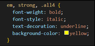
You could write some CSS code like this that would do the same thing as nested <i><b><u><mark> </mark></u></b></i> tags for any text that you placed between opening and closing em tags, strong tags, or span tags with an assigned class name of all4, as in <span class="all4"> </span>. This would produce text that looks like this, which is italicized bold text that is underlined and highlighted in yellow. And of course, that highlight color could be any color you prefer to yellow, but the rules for mark will keep the same yellow highlight color, unless you decide to change the CSS for that as well.
Let's do another project to help us understand how to use span classes.
The Spanner Project
The Spanner Project uses 70 pairs of opening and closing span tags, and it has seven span classes that change the color of any text that is between the opening and closing span tags, and that use a specific span class. There are also some general span CSS rules that all of the seven span classes inherit simply because they are spans. To see exactly how this was done, you can download the project, and then unzip the project to a folder that can be opened with VS Code. Take a close look at the source code for this project. It might seem complicated at first, but actually the use of spans is a very simple concept, as illustrated here.
What? You are bedazzled by some of the other CSS code here? This project was actually created to teach you all about using inline span elements, but we can quickly explain the other code here as well. The font-family is a sans-serif type of Google Font called Roboto. We selected this font mostly because it has a font-weight that is 900, or very bold, and we really wanted the letters in each span element to be very thick and bold. We also created a rainbow-colored linear-gradient in the background. And we used just a tiny bit of text-shadow on each letter in our span elements to make the letters stand out better. We also created a 9-pixel wide outline that has only 60% opacity (or 40% opacity, depending on how you look at it). The reason why we used an outline instead of a border is because an outline is on the outside of the container div, and we wanted some of those linear-gradient colors to show through this outline. A border would not have done that. It is also important to know that you don't have to create a border per se to add a border-radius. So, in addition, we added a nice 25-pixel border-radius to all four corners of the container div. And we added a very wide box-shadow around the container div as well. The reason it had to be so wide is because the outline is also wide, so the box-shadow needed to be wide enough to stick out beyond the sides of the outline. One unintended consequence of doing this is that it darkens the outline on the right-side and the bottom around the container div. Lastly, we added a series of media queries that will adapt this project to make it look good on almost any screen width, down to about 400-pixels wide. And, we will cover all of these CSS properties and values in future lessons.
The Block Elements Project
Let's make sure we completely understand block elements before we do a project on inline elements, shall we? Please download and unzip the block-elements project, and open it with VS Code. To fix what is wrong with that project, and to complete the project, you will need to add four lines of CSS code. You will also need to answer the seven questions. When you are done with all of that, there is a little Pop Quiz to grade you on your answers to the questions, and what you did to fix the problems. You must get 100% to pass the Pop Quiz. Good Luck!
The Inline Elements Project
Did you do OK on the Block Elements project? Did you get 100% on the quiz? It was designed to be as simple as possible, but there are several concepts there that we wanted you to learn. The first concept is how to make sure that the html document and the document body are the same size. That was easily accomplished by adding only three lines of code. And while this part of the project was not really about block elements, it is important to know the differences between those two essential parts of every web page. In the near future, you will learn all about how to do a CSS reset, which will be some CSS code that you add to the stylesheet of almost any web project you do in the future. As for the other parts of the Block Elements project, did you understand that the answer to the first question was no, until you did the bonus question? Then, the answers to all seven questions were yes. And of course, you must've realized that you needed to add a CSS rule for h3 that would change its default CSS display value from block to inline. That one line of code forces the two h3 headings to share the same line and sit next to each other.
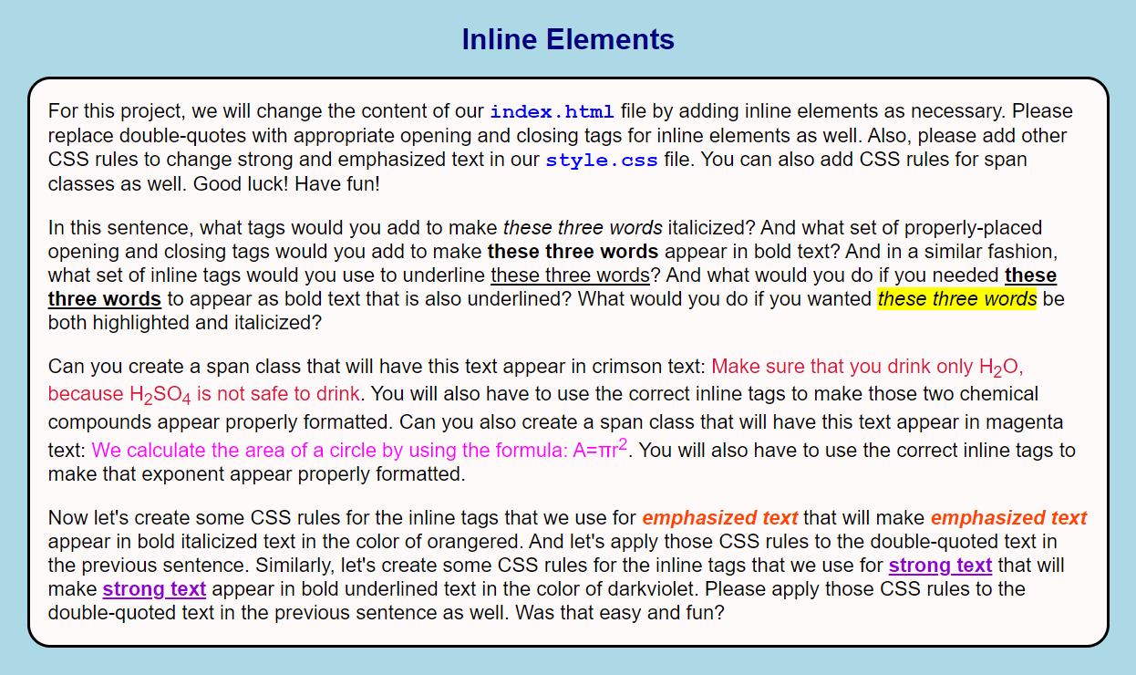
So now that we understand block elements better, let's do a project that is all about inline elements. There was lot of new inline element tags that we learned about in the lessons above. Let's see how well you remember what they are, and how to use them. We can begin by downloading the inline-elements zip file, and then extracting it to a folder that you can open in VS Code. Since you are already a pro at doing this by now, no further explanation is necessary.
The directions for how to complete this project are spelled out in the first paragraph of text. Your job will be to add appropriate inline tags to the HTML content in the following three paragraphs, and to add CSS rules to the associated external stylesheet to affect those inline elements as well. When you are done, your project should pretty much like the one illustrated below. Good luck! Have fun!
Anchor Tags

Another very useful inline element that we need to learn about is called the anchor tag. And granted, that is a very strange name to use for something as useful as a hyperlink. And <a> stands for anchor tag in much the same way that <p> stands for paragraph. What anchor tags and paragraph tags have in common is that they both require opening and closing tags, even though a paragraph is a block element. However, just as an <img> tag is incomplete without a src attribute, an <a> tag is incomplete without an href attribute. And href stands for hypertext reference, which is the one thing that makes the <a> tag somewhat similar to the reserved word <link>, in that they both must use an href or hypertext reference. However, the <link> is used in the document head to link our favicons and CSS stylesheets to our HTML web pages. And on the other hand, anchor tags are used to provide hyperlinks in the document body. But the hyperlink references in anchor tags are used to link other web pages, and to link to other parts of the same web page, and this is done by tagging them with anchor tags. And from here on out, we will use the word link to refer to any hypertext reference, whether it comes from a <link> in the document head, or from an <a> tag in the document body.
Was that explanation as clear as mud? Did we drop our anchor into deeper mud? Not to worry! Like other topics we are learning here, simple examples often add lots of clarity. So, let's do another project that will show us how to build anchor tags. Click here to download the Anchor Tag Builder project. And you already know how to unzip that project to a folder so that you can open it in VS Code. Please return back here when you complete that project.
Anchor tags have been around since Day One on August 6, 1991. The very first website was absolutely peppered with anchor tags. And there, you can see early HTML without CSS, and how early anchor tags were always shown in underlined blue text by default. That is, until you click on one of them, and then return to that web page. At this point, it is considered to be a visited hyperlink. And once visited, the anchor tag is shown in underlined purple text. Click on one of these links, and then use your browser's back-arrow, and you will see how it has changed. Even today with our modern HTML5 and CSS3, these are the defaults for all anchor-tagged hyperlinks. And now is as good of a time as any to introduce you to CSS pseudo-classes for anchor tags.
But before we dive in too deep, you need to know that pseudo-classes use only one colon and therefore are known as pseudo-selectors. But there are also pseudo-elements, and they use double-colons. For now, we will avoid a going into a deep discussion of both of these advanced subjects. But an example of a pseudo-class that we will learn about next is a:hover { } which you have probably already seen before, and it is technically called a pseudo-selector because it selects any anchor tag that is hovered over. An example of a pseudo-element would be a::before { } which refers to the element before any anchor tag. And that's a deep enough dive into that subject for right now.
Anchor Tag Pseudo-Classes
In order to talk about this, we want you to develop a love-hate relationship with anchor tags. Or more correctly, we want you to develop a LoVe-HAte relationship. Please notice the extra emphasis on the letters LVHA. The L stands for link, while the V stands for visited, and the H stands for hover, while the A stands for active. And now with our anchor stuck firmly in extremely deep mud, let's dive in over our heads, shall we? We are going to call this next project (what else?) Anchor Tag Pseudo-Classes and this little project will help you learn what all of this means. So please download the zip file. You know what to do after that, right?
Using Images As Links
Were you unaware that you can place images between opening and closing anchor tags just like text? Well, you can. And these links actually work about the same way as text links. This next project called Images As Links will tell you all about it.
Inline-Block Elements
So far, we've talked about Block Elements and Inline Elements, but we never really got around to discussing Inline-Block Elements, which are basically just hybrids of the other two types of elements. Remember that these three types of elements are the default values for the display property. So, if you don't want a certain element to behave as one type, you can assign a different value to its display property. We did this in a previous project called the Block Elements project by changing the default display property of block to inline so that two h3 headings could sit next to each other on the same line.
The biggest reason why this is important is because all <img> elements are inline-block by default. And you will see that very clearly in this Display Review Project. And you can download the code for this project by clicking here.
Using Anchor Tags As Buttons
We haven't really discussed HTML button tags yet. But this project called Fun With Buttons will show you how buttons and anchor tags can actually be very similar in several ways. We will learn more about buttons next, but this will be a quick introduction to them. And eventually, we will also learn how to make navbars (navigation bars), menus, and pull-down menus, all of which use anchor tags as well. But first, we have to learn about lists and list items before we can do that. Anyway, the importance and versatility of anchor tags and their associated hyperlinks cannot be understated. Please return back here after you have completed the Fun With Buttons project.
Buttons
In the last project, you learned how to link an external website by using an anchor tag that looked like a button, and by using a true button element that had a little bit of JavaScript code attached to it. By default, an anchor tag has a default display value of inline, so it behaved differently than the button when we tried to style it. By default, a button has a default display value of inline-block. Remember how all those cherries lined up in a row? That was because they were all <img> elements, which also have default display values of inline-block as well. So now is the perfect time to learn about buttons.
We already learned how pseudo-classes can be helpful when we use CSS to style our anchor tags. Now we will learn some other CSS styling techniques that we can use for buttons. Actually, there are dozens of websites that offer pre-written CSS button code. But we believe that learning some of our CSS button styling techniques will help you develop some really great button styles of your own. So let's reopen the code for the Fun With Buttons project again so we can look at the code we used there.
If you look at the code in the index.html file, you will see that we created a div with class called buttons on line 43, with its closing div tag on line 51. Between those div tags, we created an anchor tag with an id called btn1, and we created a true button with an id called btn2. And for now, you can just ignore the rest of the HTML code, because we are mostly interested in the CSS styling of these two buttons.
Now, let's look at the code in the style.css file. The code with the most interest here starts on line 62 and ends on line 94. On line 62 through line 73, we styled both buttons to make them look as identical as possible. To the most casual observer, they probably appear identical. One of the rules we wanted to change was the value of the display property on line 65, because we wanted both buttons to become block elements, and now they are. On line 64, we made the color of the text navy, and on line 72, we added a box-shadow. The beauty of this box-shadow is that it gives each button a 3D effect. The values of these two properties will be changed later, so that is why we wanted you to notice them now.
On lines 75 through 78, we added some rules that #btn1 required to make it look and behave like #btn2. In a similar fashion, lines 80 through 83 were required to make #btn2 look and behave like #btn1. And under normal circumstances, we would've only used buttons, and then we could have styled them all the same way.
Now let's look at the two hover pseudo-classes on lines 85 through 88. When we hover over one of these buttons, the color of the text changes from navy to crimson. When we move the mouse away, it changes back to navy. But we also need to pay attention to the two active pseudo-classes on lines 90 through 94. If we take the extra step of clicking and holding down on one of these buttons while hovering, we will notice that the box-shadow disappears completely! It's magic! We used the same box-shadow rules on line 93 as we did on line 72, but we used the color transparent instead of the color black. When we release the mouse button, the button pops back up with a black box-shadow and navy text. But in this case, we can't really see it because the link is activated and the web browser jumps to the newly-opened tab.
Maybe another example would illustrate this better. Do the same experiment on the button below. Hopefully, this is a better way to show the 3D effects and the button animations that these two pseudo-classes can offer us.
So that's our little game of "Button, button, who's got the button?" And you're it!
Lists & List Items
We now have one final topic to cover, and then we can move on. And the final topic is all about lists and list items. Basically, there are three types of lists: ordered lists, unordered lists, and description lists. Perhaps an illustration would help.
There are three types of lists:
- Ordered Lists
- Unordered Lists
- Description Lists
An ordered list is a list that contains numbered list items, while an unordered list is a list that contains bulleted list items. The list above is an ordered list. The list below is an unordered list. It doesn't get much simpler than that.
There are three types of lists:
- Ordered Lists
- Unordered Lists
- Description Lists
A description list is a list that contains two parts for each item in the list: a description term <dt>, and a description definition <dd>. This type of list is seldom used, so you may never see one. However, we will see two of them in The Lists Project that we will get into very soon.
All three types of lists can contain any number of list items inside of them. In the case of unordered lists, you have several options about which list-style-type you would prefer for the actual bullet points in your list. In the case of ordered lists, you have several options for the list-style-type for the type of numbers or letters used in your list. And of course you can always add you own CSS style rules as well. Next, we will look at a project to help us visualize how to make lists.
The Lists Project
Click on the following link to download the code for The Lists Project. It will be important to look at the actual code to fully understand the three types of lists. However, you can click here to preview the project.
This project has 15 different examples of lists, some of which you might recognize from other lessons you did earlier. Each list is contained in a numbered box with a red number in the upper right corner of the box to identify it for your convenience.
Lists 1, 2, and 3 are all ordered lists with three list items in each one. We used default CSS for these three lists. The default list-style-type for ordered lists is decimal. You will notice that the items are neatly numbered and arranged for easy readability. Sometimes Default CSS does a great job, and no other fancy CSS rules are actually required.
Lists 4, 5, and 6 are all unordered lists. List 4 has three list items in it, but we used a list-style-type of square for the bullet points in this unordered list. In CSS, that is written as list-style-type: square;. List 5 has six list items in it, but we used the default list-style-type of disc for these bullet points. Of course, the best thing about using Default CSS rules is that they are already embedded in your web browser, so no additional code needs to be written by you. List 6 also has six list items in it, but we used the list-style-type of none for these bullet points. In CSS, that is written as list-style-type: none;. Sometimes you will find that having an unordered list with no visible bullet points is preferable. Lists 5 and 6 also have some other fancy CSS formatting going on there, and we are using some special characters, which you will learn about when we get to the lessons on Text & Fonts.
Lists 7 and 8 are two more examples of ordered lists with four list items in each one. The only things that set them apart from the ordered lists you've already seen is some special CSS formatting and special characters.
Lists 9, 10, 11, and 12 are four more examples of unordered lists with two list items in each one. Rather than concentrating on the special CSS formatting and special characters, let's instead focus on the four different types of bullet points used here. In list 9, we used the default list-style-type of disc for these bullet points. In list 10, we used a list-style-type of square for the bullet points. In list 11, we used a Unicode character for an arrowhead. In CSS, that is written as list-style-type: '\27A4';. You can liven up your lists by using special characters and even images for your bullet points. And if you look at the CSS code we used for list 11, you will see that we used actual bullet images for our bullet points. In CSS, that is written as list-style-image: url('bullet.png'); As you can see, we used the list-style-image CSS property for this rather than the list-style-type. We also used another CSS property and value list-style: inside; which indents the bullet points a little bit more to accommodate fancier bullet points.
Lists 13 and 14 are two examples of description lists with three list items in each one. As discussed earlier, a description list is a list that contains two parts for each item in the list: a description term <dt>, and a description definition <dd>. As you can clearly see, the description term is unindented on one line, followed by the description definition, which is indented on the following line. We added some other CSS rules to format these lists to make them a little prettier, the most important of which was a little bit of bottom padding after each description definition.
And finally, list 15 is yet another ordered list with four list items. It is here mostly to illustrate that each list item can be a long block of text.
The only thing we failed to show you here is some other way to format the numbers in an ordered list. As previously mentioned, the default list-style-type for ordered lists is decimal numbers, but other values are certainly possible. If you preferred, you could have values of lower-latin letters, or upper-latin letters, or upper-roman numerals, or lower-roman numerals, and there are many others, depending on the alphabet used by the actual spoken language your web pages are written in.
So as a quick illustration of yet another way to number an ordered list using upper-roman numerals, please take a look at this web project, and you can download the code for this project here.
Making Navbars Using Lists
One of the main goals in this section called The Good Stuff was to get to a point where we could begin to talk about making navigation menus which can be of many different types and styles. There are horizontal navbars, vertical navbars, pulldown menus, and hamburger menus, to name a few. However, it would be impossible to discuss these subjects without a solid understanding of anchor tags and unordered lists. Now that we have a fairly good knowledge of these HTML elements, and how to style them with CSS properties and values, we can begin to approach these topics with more clarity.
But the immense topic of creating navigation menus is a huge lesson all in itself. However, our friends at W3Schools have one of the most comphensive How-To guides on the subject at How-To Menus, which lists over 50 different ways to create menus and navigation bars for just about any possible project you could think of. And why should we duplicate their work poorly, when W3Schools has already done this work for us so masterfully?
So for now, we will try to satisfy your hunger for such knowledge with a teaser project. In this project, we will create a simple horizontal navbar using an unordered list and anchor tags. In future lessons, we will get much more deeply involved in making navigation menus.
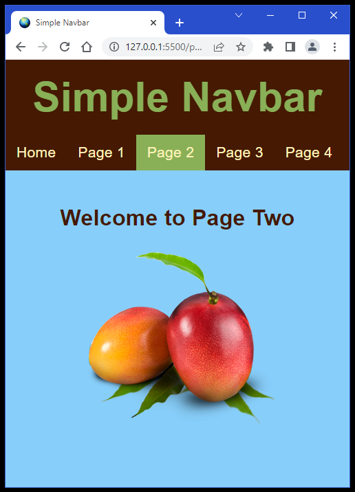
Click on the link to preview the Simple Navbar Project, and then click here to download the source code in the form of a ZIP file. When you unzip the file and open its folder in VS Code, you may be surprised to see the utterly simplicity of this project. Yes, it is indeed a multi-page website, but all five web pages are basically the same. There are only a few things that are unique to each page: the image, the welcome h1, and the current id that highlights which page we are visiting on the navbar. Otherwise, the HTML code is identical on all five web pages. With the exception of the current id, the navbar especially is the same on all five web pages. And the navbar is not even called a navbar here. It is an unordered list with five list items in it. And each of the list items contains a simple anchor tag that links each list item to a different web page in this website. Are you impressed?
However, we've seen lots of unordered lists by now, but this is the first one we've seen that arranges all of the list items horizontally rather than vertically. And to understand why this is happening, we'll need to look at the CSS stylesheet. The CSS rules for the ul { } are on lines 34 through 40. On line 36, we have list-style-type: none; which is necessary to remove the bullet points. The only other line that seems new to us is line 37, which states overflow: hidden;. And we actually need that line to prevents a few strange behaviors from happening. If you don't believe us, comment out that line temporarily to see what happens. But that is not the code that is arranging all of our list items horizontally rather than vertically. Lines 42 through 44 contains the only li { } CSS rules we have. And for these list items, we only have one rule: float: left;. We haven't talked about floats yet, because they are considered to be the old-fashioned way of doing things. Nevertheless, this rule causes all of the list items to be on the same line and float over to the left side of the navbar in order. And if you comment out line 43, you will see the old list item behavior returning. And it's not what we want here.
But why would this float: left; CSS rule be considered to be old-fashioned? After all, it only requires this one short line of code to get the job done, right? Yes, that is true. But you will find that modern CSS authorities prefer that you use flexbox rules to accomplish this task, even though it would probably require three lines of code here to do the very same thing. So for now, let's be old-fashioned.
Now let's examine the anchor tag code for these list items on lines 46 through 59. On line 48, we state text-decoration: none; and we already know what that does. It removes the default underlines for anchor tag links. Everything else looks familiar except line 52, which changes the default value of the display property from inline to block. All that basically does is add some padding to each anchor tag. Remember from the Display Review Project that the default CSS display value for an anchor tag is inline, so we can make it behave more like a button by changing its display value to block. Line 53 may seem unnecessary, but sometimes links show up with outlines on older Firefox browsers, so we include that line to fix that problem. Thanks Mozilla! And there is more code to change the hover colors below that on lines 56 through 59.
But we did not explain the current id code and that is on lines 61 through 66. Remember that an id is only supposed to be used once on a web page, while a class can be used multiple times. But since there is only one currently selected link on each of the five web pages, an id works perfectly in this instance.
To explain this current id code a little bit better, please take the time to view the HTML code for each of the 5 HTML web pages: index.html, page1.html, page2.html, page3.html, and page4.html. Notice that there is only one id="current" in one of the list items in the unordered list on each web page. So we did not lie to you about using only one uniquely-named identifier per web page. This will become increasingly more important when we learn about JavaScript because that language uses those unique identifiers to know which element in the DOM it is modifying or manipulating. Otherwise, it might change the wrong element. But as usual, we are getting way ahead of ourselves here.
Other web developers might use something similar to this current id called the selected id. In that scheme of things, it would be defined as id="selected". The name of the id used is not as important as understanding the reasoning behind using that id "label". We used the term current id on each web page because it identfies which web page of the five we are currently viewing. However, using the term selected id identifies which list item in the unordered list we have selected. Both ways are very descriptive and therefore helpful to a web developer. Each web developer will develop ways of doing things that make the most sense to each one of them.
But wait! Isn't the code for that #current id almost the same as the code for li a:hover? Yes it is. However the code on line 64 (pointer-events: none;) prevents the hover effect for the link on the navbar to each current web page. We hope that makes sense to you. Nevertheless, you can always comment out line 64 to see how annoying that hover effect can be on each web page. OK?
Before we leave this Simple Navbar Project that was done as a multi-page website with CSS, we would like you to take a look at this very similar project called the Produce Shed that was done as a single-page website using both CSS and JavaScript. Since we haven't learned much JavaScript yet, we won't bother to explain everything that is going on here. But we wanted you to know that there are multiple ways to accomplish the same thing when creating navigation menus. Click here to download the Produce Shed source code. And feel free to unzip it and open it in VS Code and view all of the code that makes this magic possible.
Summary
The Good Stuff was actually a whole lot of stuff to learn all at once, but we will summarize it all here, so that you can quickly review everything we learned in these lessons.
In the Plane Geometry project, we set the groundwork for understanding how to make the document body the same size as the html document. This will be invaluable later when we write code for CSS Reset, which we will use in almost all future projects. We also quickly introduced you to flexbox, and you will eventually find that it is a very useful tool for doing web page layouts. We also learned the basics of mobile responsive CSS in that, it is easier to write code that automatically resizes to fit any screen, rather than having to write a lot of media queries later in an attempt to make your web pages pixel perfect. We also learned more about margin and padding, and we learned the differences between a border and an outline. So you see, this project was less about Plane Geometry than it was about the essentials of good web development.
Then, we learned More HTML Tags, because some of these tags are as much about CSS styling than they are about displaying content on your web page. And of course, we are talking about the three default values for Display Properties: block, inline, and inline-block. Knowing the differences between Block Elements and Inline Elements is very important to your understanding of the CSS that is required to make these elements display properly. This knowledge will give you much better control over the HTML elements that you will use on a daily basis.
We did three projects to teach us all about several inline tags and when and how to use them. And we learned the value of the span element and the use of span classes. Between the Spanner Project, the Block Elements project, and the Inline Elements project, we now have a much greater understanding of HTML elements in general, and what we need to know to style them with CSS.
Then, we learned about Anchor Tags and all the various ways to use hyperlink references in your code. And we used the Anchor Tag Builder project as a learning tool. We also learned how to effectively style our anchor tags by using pseudo-classes. We also did a project to show us that we could use Images As Links just as easily as we could use Text As Links. We also learned that images are Inline-Block Elements by default. And we did a Display Review Project to make sure we know the differences between the three default values for the display property.
And of course, it's hard to talk about anchor tags without talking about buttons. So we did a project to compare the similarities and the differences between the two. We also learned about the three types of Lists and the way we include and style List Items. We did The Lists Project as a way to understand almost everything there is to know about Lists. And to wrap it all up nice and neat, we learned how to combine an unordered list with anchor tags embedded inside of list items to form a simple navigation bar.
Can you believe we covered all of that material in one long section? Now you know why we called this section The Good Stuff.