CSS Coding Course
CSS 101
Part 6. Color
Left-Brain vs Right-Brain

Science has pretty much disproven the concepts of left-brained versus right-brained thinking. And while it is true that the human brain has two hemispheres that are roughly the same size, the notion that the left hemisphere is primarily the seat of thinking that is intellectually logical and analytical, while the right hemisphere is where all intuitively creative and artistic thought originates has now been largely debunked.
Nevertheless, it does seem true that many people have natural proclivities towards one of these two sides more than the other. People who are not good at math and science tend to favor getting a Bachelor of Arts (BA) degree in college rather than a Bachelor of Science (BS), but this notion that the tendency to be more artistic and less logical is ruled by one-half of the brain over the other half is mostly nonsense.
Take the field of music for instance. A good musician certainly needs to be creative and artistic, but not without good counting skills and a good sense of rhythm. Or you might find that you don't like math personally, but it is an essential life skill for keeping your personal finances. So, you will end up learning it whether you like it or not. Similarly, you may not have great calligraphic handwriting skills, or you might find it challenging when forced to aesthetically wrap a gift package with colorful paper and ribbons. But that does not mean that it's not a practical skill that you cannot or need not learn in life.
The main point here is that good web developers need to develop both their logical and analytical skills as well as their creative and artistic skills. Writing the code that makes your web pages function certainly requires logic and data analysis. But you also need to develop a keen eye for aesthetic presentation that helps to make your web pages pleasing to the eye, along with an intuitive interface that makes your web pages easy to understand and easy to use by your target audience, the users.
UI/UX
There is a lot of discussion these days on the web about the importance of the User Interface (UI), and equally about the importance of the User Experience (UX). Supposedly there are huge teams of web designers and web developers who work together on projects. Rumor has it that savvy marketing professionals (who don't know much about writing code) can become web designers and get paid large sums of money to create wireframe diagrams and spreadsheet presentations, so that they can dictate their future web design plans to the web developers, who will in turn write the web code for them. They would also lead you to believe that this is such extremely important work that some designers specialize in the UI, while other specialize as UX designers, even though the line that divides one area of expertise from the other seems rather blurry. This is an interesting way of thinking, even though it complicates what should be two very simple concepts.
We believe that web developers need to learn to write code well, and the end result will be attractive and intuitive web pages. And that is probably enough said on the subject of UI/UX.
Color
One of the tools we use to make our web pages more beautiful is color. As of this writing, HTML5 and CSS3 support the maximum number of colors that modern computers can display, and that number is 16,777,216 (or 224) colors. In addition, each one of those colors has 256 possible levels of transparency or opacity. But don't let these numbers scare you because we have several easy ways to deal with the complexities of this huge number of color choices.
The easiest way to deal with this complexity is by using the set of 148 Named HTML Colors. One of the projects you can download here will let you create a web page that displays all 148 of these colors. You can use this project as a handy reference guide when you are designing your web pages. (Actually, there are 149 named HTML colors, if you count transparent.)
And we will show you two other ways to display colors as well. Using the standard RGB (sRGB) colors, and the codes for those colors, you can display all 16,777,216 colors and their 256 levels of transparency or opacity using what is called the alpha channel. You can also display all 16,777,216 colors using their Hex codes.
If you have not done so already, please download and extract the Named HTML Colors ZIP file and create the project from that file (you know the drill). When you open the web page, you will see a colorful table with four columns. In the three columns on the left side, you will see the HTML Color Name, the Hex Value, and the RGB Value for each of those colors as well. In the column on the right side, you will also be able to see the Actual Color produced by any one of the three different ways to display each color, which are listed on the left. We hope you find this Named HTML Colors chart to be a useful tool for finding named HTML colors that you'd like to use in your projects. To preview the Named HTML Color Chart without downloading, unzipping, and opening the project, you can simply click here.
Physics
The physics of color theory is a huge subject that goes well beyond the scope of this course. So, to simplify matters, we will gloss over most of that material (pun intended).
If you were taught in school that the three primary colors are red, yellow, and blue, and that all colors are derived from these three colors, you were not lied to. But those "colors" are the three primary pigments. Pigments are used to make and mix all the colors of paint on the artist's palette, and pigments are used in many other fine arts and graphic arts mediums.
When we speak of color from now on, we will be talking about light. Light is the part of the electromagnetic spectrum that can be seen with the human eye. All the colors in the rainbow and all the colors we see when we hold a prism up to the light are just that: colored light. And what shines out of your computer monitor screen or mobile device is light. Our in-depth physics lesson basically ends right here.
What we will be referring to as color here is called the RGB color space. In the RGB color space, red, green, and blue are the three primary colors, and all colors can be created as a mix of these three primary colors. The number of possible colors is infinite, but a human eye looking at a computer monitor screen, or the screen on a mobile device, can see no difference between similar shades of the 16,777,216 colors we can create. So, for our purposes, that rather huge number of colors will be completely sufficient.
RGB Values

Now let's talk about RGB values. All colors in an RGB value consist of three values (0 – 255) which represent the amount of Red, Green, and Blue. The RGB value for black is rgb(0, 0, 0), or no colored light of any color. Turn off all the lights at night and what color do you see? By contrast, the RGB value for white is rgb(255, 255, 255), or an equal amount of the maximum values for red, green, and blue. When we combine all three, we get white. See the illustration to the right. This illustration also shows us that the equal combination of all three pure colors of red, green, and blue produces white light. It also shows us that the complete absence of all three colors produces black (or total darkness, if you will). Also, besides showing us the three primary colors of red, green, and blue, it shows us the three secondary colors of yellow, cyan, and magenta. In other words, the equal combination of pure colors of red and green light produces yellow light. While the equal combination of green and blue light produces cyan light. And lastly, the equal combination of blue and red light produces magenta light. These are only eight of the possible colors, but they might be the eight colors that are most important.
Just FYI, you might see the acronym CYMK used in conjunction with the toner or ink you are purchasing for your color printer. CYMK stands for Cyan, Yellow, Magenta, and blacK (they used K for black because B usually means Blue). So, you surely recognize the CYM as the secondary colors we mentioned earlier. However, we are back to talking about pigments rather than colors. And printer technology has found that it is nearly impossible to combine cyan, yellow, and magenta to get pure black. What you get instead is usually some horrible shade of dark brown. So modern color printers have black ink or toner as one of their color cartridges. And besides, when you are printing pages that have little or no color, you will be printing with black, so that is the color cartridge that you run out of most frequently.
But let's get back to talking about screen colors (light) rather than printer colors (pigments). The RGB value for cyan is rgb(0, 255, 255), and the RGB value for yellow is rgb(255, 255, 0), and the RGB value for magenta is rgb(255, 0, 255). And this should start to make sense as we see how to mix equal portions of only two of the three primary colors to create the three secondary colors. Also, you should know that cyan and aqua are the same color, because they both have the same RGB value of rgb(0, 255, 255). And magenta and fuchsia are the same color, because they both have the same RGB value of rgb(255, 0, 255). And as you might have already guessed, red is rgb(255, 0, 0), and blue is rgb(0, 0, 255). But now it gets a little trickier because green is rgb(0, 128, 0), and the color that you thought was green is a very bright shade of green, so it is called lime instead, and its RGB value is rgb(0, 255, 0). And yes, that might seem inconsistent, but that's just the way it is in the world of Named HTML Colors.
Nevertheless, you should now be starting to see that we can mix these three primary colors in various proportions to produce any one of the 16,777,216 colors that we can have on our color palette. For instance, the named HTML color mediumvioletred has an RGB value of rgb(199, 21, 133), while the color named lightgreen is defined as rgb(144, 238, 144), and hotpink is defined as rgb(255, 105, 180).
And before we move on, there are seven more colors that have two names for the same RBG value, and that exists mostly because there are two ways to spell one word. With HTML and CSS, we don't have 50 shades of grey. Instead, we only have 7, but all 7 have duplicate names for the same RGB value. And that is because the word can be spelled either as gray or grey, so take your pick and spell it either way. Take a look at the Named HTML Colors project that you downloaded and installed earlier, and you will see what we mean.
So let's revise what we said earlier about there being 148 Named HTML Colors (actually 149, if you count transparent). Yes, technically there are 148 names. But since 9 of them represent duplicate colors, those names only represent 139 different colors (actually 140 if you count transparent). But you really shouldn't count that "color" since it is completely invisible to the human eye. How's that for TMI?
Unnamed HTML Colors
But what about the other 16,777,077 colors (16,777,216 - 139) that are unnamed? That's a great question. Amazingly enough, they can have RGB Values or Hex Values that can be defined 100% by you! The next project you will download and extract is the Custom Color Mixer, and you should be a master at unzipping files and creating these project folders by now. With this useful tool, you can create all of the 16,777,216 colors and generate code for each background-color and foreground color that you would like to use. And these codes are generated automatically in both RGB Values and in Hex Values. There are also controls for mixing red, green, and blue color components. The slider controls allow you to adjust color mixtures quickly, but there are also a series of button controls that allow you to incrementally fine-tune your mixtures up or down one step at a time. And we hope you find this tool useful. To preview the Custom Color Mixer without downloading, unzipping, and opening the project, you can simply click here.
And there are many names being used unofficially for colors that are not accepted as any of the 148 officially named HTML colors. So, you can call them anything you want (and maybe even create CSS variables or classes that define those color names). But most often, you will simply use and specify these colors by the RGB values you define.
Here is an unnamed color that we just made up: rgb(237, 103, 142), and we decided to call it bubblegum, but we will use its RGB value in our CSS stylesheet because HTML, CSS, and JavaScript never heard of a color named bubblegum (unless we define it by name using CSS variables or classes).
If you have more interest in defining names for custom colors that you create, then you might want to download and extract the Stone Bridge Project (and you already know how to do that). And then open it in VS Code to see the two custom colors defined in the :root { } of the external CSS stylesheet. This is an advanced subject that we will visit again in a future lesson, but we created a CSS variable for this unnamed color we named bubblegum, and another unnamed color we named stone, that we can use whenever we want by using those CSS variable names. Other things that you might find interesting in this project is a partially transparent veiled overlay, and a demonstration of transparency as both a button background-color and a button border. But once again, we will explain more when we revisit this project sometime in the future.
Before we jump into the next section, and if you are somewhat unfamiliar with the hexadecimal numbering system, then you might want to follow our side tutorial on Numeral Systems where you will learn about all of the various numeral systems we use in computer science, especially the hexadecimal, decimal, and binary numbering systems.
Hex Values
So far, we have avoided talking about Hex Values, but they are simple to understand, especially if you have prior knowledge of the hexadecimal numbering system. If you don't know what the hexadecimal numbering system is, then you can learn about that from other sources. Otherwise, it should suffice to say that, for every RGB value (which is defined in the decimal numbering system to make is easier for humans to understand), there is an equivalent Hex value (which is defined using the hexadecimal numbering system to make is easier for computers to understand).
As an example, let's use the bubblegum color we created above. It has an RGB value of rgb(237, 103, 142), and it also has a Hex value of #ed678e. So, we could use either value in our CSS stylesheet and get the same exact color.
Now let's explain how this works. All Hex values have six hexadecimal digits preceded by a # sign (which is also known as a hash tag, pound-sign, or octothorpe). And the first pair of digits are for red, the second pair of digits are for green, and the third pair of digits are for blue. In fact, you can even use RGB values and Hex values to convert between these two numbering systems if you like. (And we will discuss that in more detail when we get to the section on ColorZilla).
Let's analyze this further. The RGB value of rgb(237, 103, 142) has a red amount of 237 in it, a green amount of 103, and a blue amount of 142. Now, if you convert 237 from decimal to hexadecimal, you get ed, and if you convert 103 from decimal to hexadecimal, you get 67, and lastly 142 in decimal is 8e in hexadecimal. When you combine the three RGB values in Hex, you get a Hex value of #ed678e. Simple, right?
So, the format for a Hex value is #RRGGBB, which means that the red value RR, the green value GG, and the blue value BB must be at least two hexadecimal digits long. And even if you know nothing about the hexadecimal numbering system, you should know that 0 in decimal is 0 in hexadecimal, and that 255 in decimal is ff in hexadecimal. And since each color value in a Hex value must be at least two hexadecimal digits long, the color black has a Hex value of #000000, and the color white has a Hex value of #ffffff, and the color lime has a Hex value of #00ff00.
Three-Digit Hex Codes
But wait! You might have seen instances where there were Hex values that only used three digits instead of six. Ah yes, this is shorthand for Hex values where both digits in all three of the RR, GG, and BB pairs are the same. In cases like these, a Hex value of #000 is the same as #000000, which is the color black, and #fff is the same as #ffffff, which is the color white, and #a0c is the same as #aa00cc, which is some weird shade of pinkish purple. But the main point here is that all three pairs of both digits that represent the red RR color value, the green GG color value, or the blue BB color value must match in a three-digit Hex value code.
The Alpha Channel
Next, we need to discuss the alpha channel, which will explain how each of the 16,777,216 possible colors can also have 256 levels of transparency or opacity. And with that discussion, we will also have to once again mention the named HTML color of transparent, which is completely invisible and therefore somewhat hard to illustrate, but necessary. Let's see some examples to help us understand the necessity of having a transparent color.
The reason why we need this color is because we might be doing something like using a black box-shadow around a button that disappears when you click on the button. Doing this will create the illusion of a three-dimensional button that slides in when you click it, and then slides back out when you unclick on it. An example that illustrates this phenomenon can be found by clicking the button below.
When you click on the button above, the box-shadow color value around the button changes from black to transparent. And then after you clear the alert, the black box-shadow comes back. You might notice that every button on this website employs this technique. And you can see more examples of using transparent color in the Stone Bridge Project.
But we strayed way off subject with that. We were planning to discuss the alpha channel, which lets you specify some nominal degree of transparency or opacity in your RGB Value or Hex Value. Otherwise, your color is either 100% opaque or 100% transparent. And with this discussion of the alpha channel, we will be discussing RGBA values and 8-digit HEX Values.
RGBA Values
For example, a color like rgba(0, 0, 0, 0.50) is black, but it is also 50% transparent, because it is specified in RGBA format. The A in an RGBA Value is the alpha channel, and it is represented as a decimal percentage with possible values that can be anything from 0.00 (0%) to 1.00 (100%) in our RGBA value. That means that an alpha channel value of 0.50 is 50% transparent, and 50% opaque as well. Is that confusing? Is the color half transparent, or is it half opaque? You tell me.
So what this means is that rgba(0, 0, 0, 0) and transparent are the same exact color, because regardless of the RGB value, the alpha channel is making it 0% opaque (or 100% transparent, you decide). If you have text that is defined as this color, that text will be completely invisible, regardless of the background-color that you place this text in front of. On the other hand, rgba(0, 0, 0, 1) and black are the same exact color, because the alpha channel is making it 100% opaque (or 0% transparent, if you will).
The reason why the alpha channel has any value to you as a developer is because of its ability to change the opacity or transparency of some color so that the color (or image) behind it can show through. You may want to provide a veil over something like a background image, and the alpha channel is the ticket that lets you do that. Again, to see an example of this in action, revisit the Stone Bridge Project.
8-digit Hex Values
In addition, the same method we use to convert RGB values to 6-digit Hex Values is the same method we employ for converting RGBA Values to 8-digit Hex Values. The format for an 8-digit Hex value is #RRGGBBAA, where AA is a hexadecimal value between 00 and ff, and that hexadecimal number represents the percentage of transparency or opacity. So, if we convert the RGBA value from the example above, which is rgba(0, 0, 0, 0.50) or black with a 50% transparency, the equivalent 8-digit Hex Value is #00000080 because 80 in hexadecimal is 128 in decimal, and that represents 50% being halfway between 0 and 255.
4-digit Hex Values
But if you thought we were done, there is one more circumstance where you might see a 4-digit Hex Value used. And that is when all four of the RR, GG, BB, and AA values in an 8-digit Hex values are the same digit in each pair. So, a Hex value like #aa00cc88 could be abbreviated as #a0c8, which is that same weird shade of pink or purple we mentioned before, except with an opacity that is roughly 53.3%.
HSL and HSLA Values
And we wish it ended here, but unfortunately there are also HSL (Hue, Saturation, Lightness) and HSLA color codes (which use the alpha channel), as well as HSV (Hue, Saturation, Value), also known as HSB (Hue, Saturation, Brightness), and we just assume there are also HSVA colors and HSBA color values as well. But these are seldom used in CSS. You might see HSL and HSLA used, but the others are just too obscure and infrequently used to talk about. For our purposes, we would prefer to just move on, rather than getting all hung up on a long discussion of HSL and HSLA, because it is doubtful that you will see them used.
Mixing Colors on the Fly
We already introduced you to the Named HTML Colors Chart and the Custom Color Mixer projects. Please feel free to revisit them again here by clicking on the links provided in the previous sentence. And we will soon introduce you to the ColorZilla extension to Chrome. So you will already have several good tools to use when working with colors. However, sometimes you just want to create and mix a color quickly on the fly, and VS Code already has built-in tools that will help you do just that! So let's work with these built-in tools now. The easiest way to get started on that is to just download and extract this project, and then open it in VS Code. This is very easy to do, and you already know how.
One you get the project open in VS Code, you might want to Go Live to see what the project looks like. It's not very complicated, but it does use three colors: one for the background-color, one for the foreground color, and one for the color of the text-shadow. So let's view the style.css file to see those three colors.
The background-color is defined on line 7 as rgb(255, 160, 122); which is actually the exact same color as lightsalmon. But we wanted to use an RGB value here. Now if you hover your mouse over the lightsalmon color block next to the defined RGB value in your project, you will see a built-in color mixer tool pop up for you to use, just like the one illustrated in the picture below. (By the way, you can always click on the picture below to zoom-in for a closer look.)
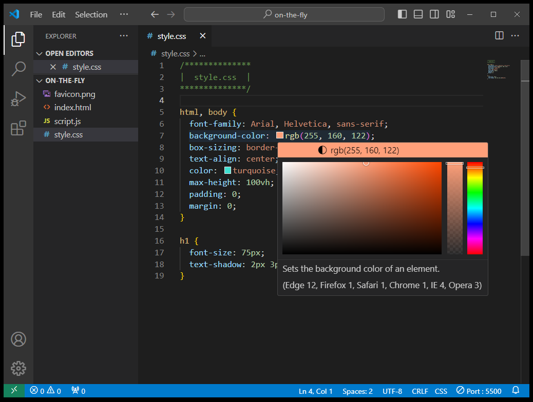
Notice that there are three ways to mix this color on the fly. There is the big square on the left, there is a slider on the right, and there is also a slider in the middle that allows you to change the amount of opacity or transparency of the color. Please feel free to use these three controls to mix your background-color, even though adjusting the transparency is probably a waste of time for the background-color since it has no other color or image behind it to show through. Also notice how the RGB value changes as you work with the three controls. Pretty cool, eh?
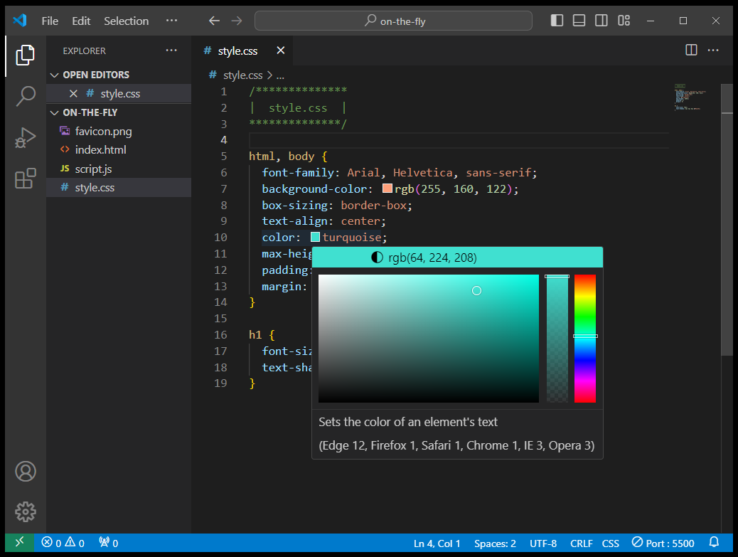
Now we can do the very same thing with the foreground color that is defined as turquoise on line 10. Notice how it shows you the RGB value for the named color turquoise and that RGB value is defined as rgb(64, 224, 208) as you hover over the color block. Also notice how the RGB value changes from a named color to the new RGB value as you move the controls around. This is very helpful when you simply want to lighten or darken some color on the fly. And please notice that your RGB value will change to an RGBA value if you start moving the transparency slider in the middle. So these controls are very powerful indeed allowing you to change and update the definition of any color you want on your web page.
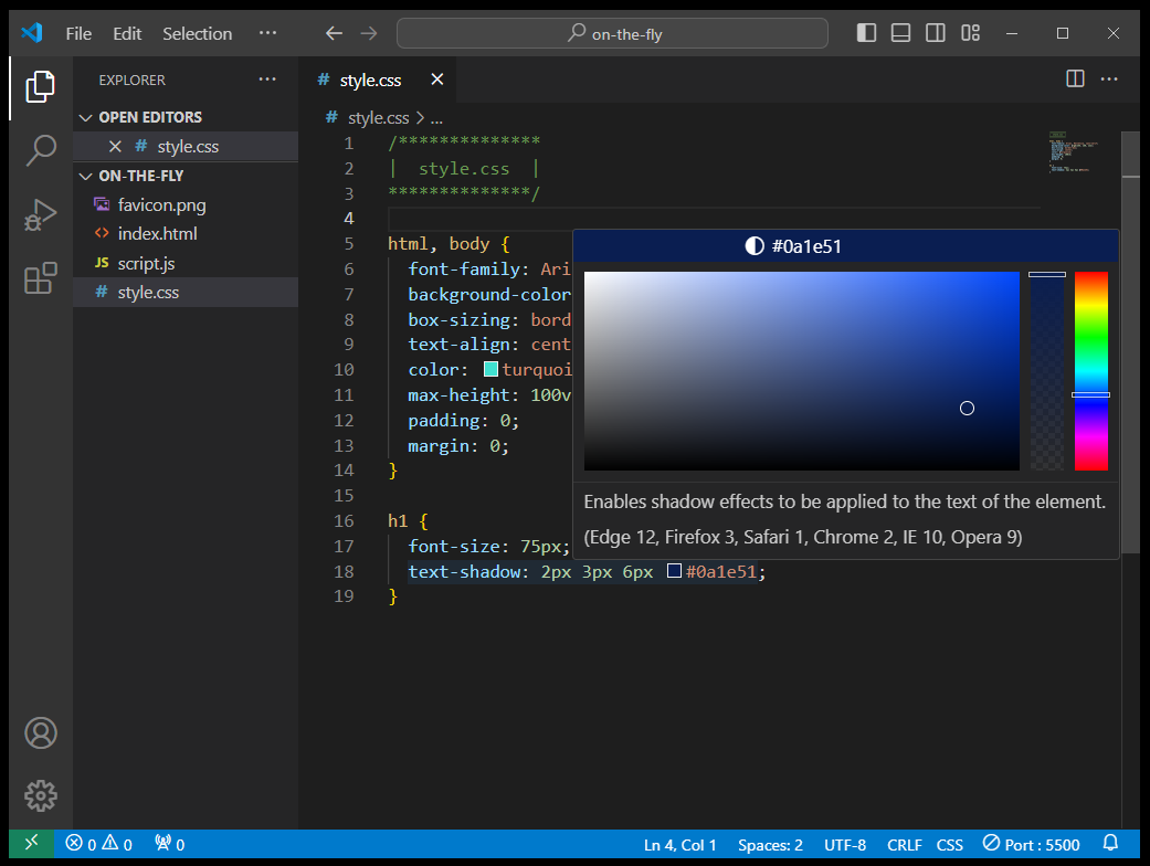
Lastly, we wanted to show you that these controls also work for a text-shadow as defined on line 18 below. If you hover your mouse over the color block, the controls for that color pop up. And we also wanted you to see how it works with Hex values just as easily as RGB values. Notice how this text-shadow has a Hex value of #0a1e51 for the color of the shadow. Please remember that Hex values are six digits and defined in the format of #RRGGBB where RR is the amount of red, GG is the amount of green, and BB is the amount of blue. That is, until you start playing with the transparency slider in the middle. Then the Hex value becomes an eight-digit value defined in the format of #RRGGBBAA where RR is the amount of red, GG is the amount of green, BB is the amount of blue, and AA is a hexadecimal number between 00 and ff which repesents the amount of transparency or opacity.
So we just learned how VS Code can help us work with our CSS color values. And this built-in tool works just fine until we are trying to create a color scheme based on the colors in some of the images on our web pages. And we've found that the perfect tool for doing a task like that is an extension to Chrome called ColorZilla which we will learn about next. Using ColorZilla's color-sampling eyedropper, we can sample the colors in an image, and then identify those exact colors to help us write CSS code. You will also find that the color-adjustment controls in ColorZilla are very similar to the ones we used in VS Code. About the only limitation to Colorzilla is adjusting a color's amout of transparency or opacity, but we already know how to do that using VS Code, right?
Installing ColorZilla

An extremely useful tool for selecting colors for the background and foreground colors in your project is the ColorZilla extension that you can add to your web browser. ColorZilla has versions for both Firefox and Chrome browsers, but since we are using Chrome as our default browser, we will download and install that version as an extension to Chrome. You can find this extension on the ColorZilla Website for Chrome. When the page loads, simply click on the blue button that says Install ColorZilla (which is version 4.1 as of this writing). Click on that button and you will be redirected to another web page where a blue button appears that says Add to Chrome. When you click on that button, a dialog box will appear that asks to Add 'ColorZilla'? When you click the Add extension button, it will be added to Chrome and a web page will appear that says ColorZilla Installed.

But there have been a few recent changes to both the Chrome web browser and the ColorZilla extension so you may
get a little yellow popup message that aims to help you with the next steps. Yes, the extension is installed but
it might not appear in the extensions area (upper righthand corner) of the browser. To make it appear, simply
click on the  icon (or the
 icon) that looks like a puzzle-piece and then
an Extensions pulldown menu will appear. ColorZilla will be one of the items on that menu. Simply click the
ColorZilla pushpin icon so that it turns blue, and then the ColorZilla eyedropper
icon) that looks like a puzzle-piece and then
an Extensions pulldown menu will appear. ColorZilla will be one of the items on that menu. Simply click the
ColorZilla pushpin icon so that it turns blue, and then the ColorZilla eyedropper
 icon should appear as an extension on the right
side of the browser's navbar. When you are done, close and restart your Chrome web browser.
icon should appear as an extension on the right
side of the browser's navbar. When you are done, close and restart your Chrome web browser.
Nevertheless, one last obstacle remains. When you attempt to click on the little eyedropper icon, a yellow warning triangle might appear next to the Pick Color From Page menu item that will be grayed out and it may be unusable until after the next step. To fix this, you'll need to click once again on the extensions "puzzle piece" to the right of the eyedropper and click on the three dots next to the blue ColorZilla pushpin which will bring up another pulldown menu. From that menu, select Manage extension. Now a whole page of settings will appear, but we are only interested in the one that says Allow access to file URLs. To the right of that is another switch that you will click on until it turns blue. That should allow you to use the eyedropper. If not, then close all tabs and restart the web browser. If at any time that yellow warning triangle appears again, and you find you are unable to use the eyedropper, simply reload that web page, and that should do the trick. This is a new feature and/or security precaution. It might take some time to get all the bugs worked out.
Using ColorZilla
ColorZilla is an amazing tool for a web designer because it lets you sample colors from any web page, and from any picture or photo on that web page as well. And then it gives you both the RGB value and the Hex value for that color!
ColorZilla has lots of items on the pulldown menu that appears when you click on the eyedropper icon, and we will let you explore those on your own. But the two items we will explore together right now is the eyedropper itself (also known as the Pick Color From Page tool) and the Color Picker Panel tool, which are near the top of all items on the menu.
When you click on the eyedropper, the top menu item says Page Color Picker Active and your cursor will turn into a crosshairs pointer. Now you can move those crosshairs over various locations on the web page and a menu at the top of the screen will show you what color you are sampling, along with several other important bits of information, like the RGB value of the color you are sampling, as well as its Hex value, and the location of the HTML element you are sampling, as well as its HTML/CSS name. However, we are probably more concerned with the actual color and its RGB and Hex values.
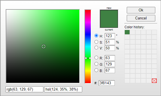
When you have decided which color you want to use, simply click on it with your mouse, and the data will be captured by the Color Picker Panel, which you can now select from the ColorZilla extension pulldown menu. When you click on the Color Picker Panel, you will see an amazing collection of data about the color you just picked! The color we just picked in this instance is some shade of dark green with an RGB value of rgb(63, 129, 67) and a Hex value of #3f8143. It also provides the HSL value (that we never really talked about) of hsl(124, 35%, 38%). You will also be able to see that the RGB value is broken down into its three red, green, and blue components that we already discussed. And the HSV values are also provided, which is another way of specifying colors that we only mentioned in passing. Notice that there are two controls that allow you to change the color. The biggest of these on the left allows you to change the sampled color as much as you want. You can use the big 2D color square or the color slider bar next to it. And by selecting the radio buttons in the middle which are labeled H, S, V, R, G, and B, you can adjust the color by hue, saturation, value (or brightness), as well as the three color components of red, green, or blue. It also provides a handy color history reference of the last 66 colors you sampled. So, there is much that ColorZilla can do for you as a web developer. And once again, this is only skimming the surface. We will leave it up to you to discover everything that this amazing tool can do!
RGB Color Values and Hex Color Values
Now if know a little something about digital computer numbering systems, you know that a byte consists of 8 binary bits, and from our discussions on RGB color values, Hex color values, and ColorZilla, you've learned that color values can be expressed in several different ways including the HTML/CSS color names, the RGB color values, the Hex color values, and also the HSL and the HSV color values. But again, we will focus mainly on the HTML names and the RGB and Hex values.
In the ColorZilla example we used above, we used an otherwise unnamed color that was a special shade of dark green, and it had an RGB value of rgb(63, 129, 67) and a Hex value of #3f8143. Now it should become clearer that RGB values are expressed as three decimal numbers, with each one defining a level of red (63), green (129), and blue (67), and with each one having a decimal value between the values of 0 and 255. And the Hex values are the same, except that each value is expressed as a two-digit hexadecimal value for red, green, and blue in the format of #RRGGBB, where in the case of this dark green color, the red component is 3f, the green component is 81, and the blue component is 43. When we combine them together, we get #3f8143.
As a matter of fact, you could use your ColorZilla extension as a decimal-to-hexadecimal converter, or a hexadecimal-to-decimal converter as well. However, you will soon learn that JavaScript already has some built-in functions that allow for numeral system conversions. And learning to convert between numeral systems is a piece of cake (but certainly not a piece of pi π).
Using Color in CSS
You should be getting good at doing this by now. We have already seen how to use color in our backgrounds by assigning a value to the CSS property called background-color. Similarly, we have already seen how to use color in our foregrounds (text) by assigning a value to the CSS property called color. Here is an example that sets the background color to a shade of dark green using an RGB value: background-color: rgb(63, 129, 67);. And here is an example that sets the foreground color (i.e. — the text color) to the named HTML color of snow and the CSS rule for that is color: snow;.
However, there is one unwritten rule that we will offer as a best design practice and some good advice. When choosing background colors and foreground colors, always pair a light background color with a dark foreground color. And vice versa, always pair a dark background color with a light foreground color. The reason for this is purely one of easy readability. If you want people to read the text you put on your web pages, you want to make it as attractive and easy on the eyes as possible. And granted, this might seem like common sense, but it is worth mentioning anyway. And in the case that you are forced to use a light-colored text on a light-colored background (like an image), the use of a well-designed text-shadow might be the answer by providing a three-dimensional look to the text, which makes the text appear to be hovering over the image that is behind it. We will learn more about text-shadows soon.
Borders & The Five Projects
An important component that we use in borders is color. There are many different types of borders, but all of them require you to define them with a color. Download and extract the ZIP file for these Five Border Projects and you will have several examples of different ways to create borders. If you study the source code each of these projects, you will see how each project uses a border to create something that looks great.
But that's not all you can learn from these five projects. You will also find somewhere in one of these five projects, the use of background-color, foreground text color, different shades of text-shadow, the use of a border-radius, the use of box-shadow (to make each of the picture frames look like they are hanging on a wall), and even a radial-gradient (inside the house to highlight the man standing inside the house). And there is a lot more CSS you can learn from these projects that isn't related to borders or color, but we will revisit these projects at other places in the course, and explain more about what each CSS rule does at that point.
Of course the best way to study the actual HTML and CSS code is to download the projects and open them with VS Code. But you can get a quick preview of each project by clicking on the name of each project listed below.
A quick description of some of the HTML and CSS in these projects might be helpful. Some of the main things to notice in the First 3 Projects listed above is the wide dark gray border #333 that uses a border radius. It should be obvious from the CSS code what rules make that happen. Something else to notice is the use of HTML divs with classes. Class names can be anything you like, but descriptive names are always best. We decided to call these divs easy-street, house1, and house2, even though this isn't a street, and these acronym pictures are not really houses. We also used an id for each h1 and used spans with class names so that we could turn some letters darkred while leaving the other letters in each word that shade of gray we defined as color: #ccc;. For all of the letter, whether they were darkred letters, or that shade of dark gray, we applied a text-shadow with the color of snow: text-shadow: 2px 2px 5px snow;. The HTML color snow is just a shade of off-white. That may seem like an unusual color choice for a shadow, because in real life, most shadows are black, or some shade of dark gray, but we wanted the text-shadow to complement the color of the letters next to it. It might seem weird and quite unorthodox, but it does seem to work well here.
When looking at the Picture Frames project, there is a lot to understand about the way each border was created. Nevertheless, an important lesson in that project is that you can define one color for the entire border, or you can define a color for each of its four sides. In its simplest form, a border can be written as border: solid 3px black; and that will create a solid black border 3 pixels wide. However, the first two examples in this project use a different color for each side of the picture frame. And if you inspect the source code, you will see how to define the color of the border for each of the four sides. And although the first two picture frames look identical (but framing different pictures), we created each of them using different code. So look at the CSS code for .gbox1 { } and .gbox2 { }. For .gbox1 { }, we defined four separate border sides on lines 39-42. However, for .gbox2 { }, we defined the border width for all 4 sides on line 53, and we defined the border-style for all 4 sides on line 54, while defining the border-color for each side in only one line of code on line 55.

And this seems like the perfect time to explain how to define four parameters at once in a clockwise fashion. Notice how we defined the four separate sides of the picture frame in .gbox1 { } on lines 39-42 in the order of border-top, border-left, border-right, and border-bottom. Since the CSS descriptor tells HTML exactly which side of the border we are defining, these four descriptors can be arranged in any order we prefer. If we wanted to define the border-bottom first, that would be perfectly OK since HTML knows exactly which side of the picture frame that refers to. However, the border-color of each side must be defined in a clockwise manner on line 55.
- The 1st parameter defines the color of the top border
- The 2nd parameter defines the color of the right border
- The 3rd parameter defines the color of the bottom border
- The 4th parameter defines the color of the left border
This four parameters clockwise technique also applies to margin and padding. Let's suppose that you create a CSS rule for some element like margin: 5px 0 25px 50px;. In that case, the margin on the top of the element would be 5 pixels wide, while the margin on the right side of the element would be 0 pixels in width, and the margin on the bottom would be 25 pixels wide, while the margin on the left side would be 50 pixels wide. See how that works? I guess you could say it works just like clockwork. The very same clockwise rules apply to four-parameter padding rules as well. And remember that it goes without saying that margin is on the outside of an element while padding is on the inside of an element. And there are undoubtedly other examples of four-parameter CSS rules. For instance, what would an absolutely hideous CSS rule like this do? border-style: dotted dashed solid double;
But in this Picture Frames project, we also wanted to give you dazzling views of what a border can do. So in the last two examples which use a ridge border and an outset border, we only defined one color for the border itself. And yet, CSS found a nice complementary color to use that will make our ridge border and our outset border really pop! Lastly, we added a bit of border-radius to the outset border, just to make it a little bit more interesting. And all four borders here have a little bit of box-shadow to make them appear like real pictures hanging on a wall. You might also notice that the ridge border and the outset border both look a little bit three-dimensional anyway. They both look like they actually bulge outward. But there are also grooves and inset borders that bulge inward. In fact, an entire lesson could be written on borders alone. And if you really interested in everything that can be done with borders, just visit The W3Schools CSS Borders Tutorial.
In the House Picture project, there is also a lot going on. If you already did the Plane Geometry project in a different lesson, then you might already know that using divs to make shapes like squares, rectangles, circles, and ellipses is actually quite easy. However, making triangles can be a huge challenge. This house is actually easy to make, but the roof on top is not. And the secret to making triangles is that we don't really use the center part of the div. If you look at the CSS code for the roof on lines 38-47, you will see that the width and the height of the div is actually 0. And any element that has a width and height of 0 exists only in theory. It actually is not visible on our web page. That's weird, right? So, the way we make a triangle is by adding wide left and right borders that are transparent (which allows the background-color to show through it). And we use no top border at all. And we have a wide bottom border that is black. And then, we put all of that orange text on top of the bottom border. Tricky, eh? So, the actual div that has no width and height is actually at the very peak of the roof, and CSS is fooled into thinking that the div really exists and so it does its best to frame a border around it by following your coding instructions.
And this might make more sense if you think about the multi-colored picture frames we made in the previous Picture Frames project. The four sides of the frame were huge, but the picture in the middle was rather tiny. And if there was no picture in the middle, and instead you had a div with a width of 0 and a height of 0, then you would have an overhead view of a pyramid, and each side of the pyramid is a triangle. Between the code for the house roof and the picture frame, this pyramid should make perfect sense.
We also need to mention the radial-gradient behind the man in the house. It's actually pretty easy to code considering that it is a spectacular use of color. Anyway, the code for that is background: radial-gradient(snow, snow, orange);. A radial-gradient background starts at the center of the div (or other element that it inhabits), and then it blends with the other colors listed from the center to the outside edges and corners. It this case, we wanted more snow behind the man, and less orange, so we actually listed snow twice. Besides radial-gradients, there are also linear-gradients and conic-gradients. And just like with borders, there is an infinite number of things you can do with all three gradient types. And if you really interested in everything that can be done with gradients, just visit The W3Schools Advanced CSS Gradients Tutorial.
Summary
This was a ton of information about color which originally seemed like a very simple concept, right? As it turns out, you could spend a lifetime studying the subject of physics, especially as it applies to visible colored light in the electromagnetic spectrum. We humans have trichromatic vision, which means that we can perceive three primary colors: red, green, and blue. And color adds beauty and aesthetics to our lives. So knowing how to create pleasing and colorful web pages is a skill that every good web developer should have in their repertoire. And as with most subjects, there is a vast warehouse of knowledge to learn beyond what was presented here, but we hope that this quick introduction will help you get started.